pacman::p_load(tidyverse, patchwork, readr, dplyr,zoo,viridis,ggiraph,forecast, plotly, timetk, prophet,glmnet, randomForest, e1071, xgboost, vapr, tidyverts, ggHoriPlot, ggthemes )Take-home Exercise 4: Prototyping Modules for Visual Analytics Shiny Application
Gross Domestic Product:
Aggregate value of the goods and services produced in the economic territory of Singapore. The GDP estimates are compiled based on the output (or production), expenditure and income approaches.
Data Preparation
Importing packages
Importing Datasets
Importing the dataset of GDP, Year on Year Growth Rate from Singstat
GDP_growth = read.csv ("data/GDPgrowth.csv")

DT::datatable(GDP_growth, class= "compact")
Data Wrangling
Mutating data for further analysis
GDP_data <- pivot_longer(GDP_growth, cols = starts_with("X"), names_to = "Quarter", values_to = "Growth.Percentage")

GDP_data <- GDP_data %>%
  mutate(
    Year = str_extract(Quarter, "\\d{4}"),
    Quarter = str_extract(Quarter, "([1-4])Q"),
    Quarter = case_when(
      Quarter == "1Q" ~ "Q1",
      Quarter == "2Q" ~ "Q2",
      Quarter == "3Q" ~ "Q3",
      Quarter == "4Q" ~ "Q4"
    )
  )

GDP_data <- GDP_data %>%
  select(Year, Quarter, Categories, `Growth.Percentage`)
Assuming GDP_data is a modified dataset with ‘Year’ and ‘Quarter’ column. Here we are going to combine ‘Year’ and ‘Quarter’ columns into a single date format to ease analysis in the next steps.
GDP_data1 <- GDP_data %>%
  mutate(Date = as.yearqtr(paste0(Year, Quarter)))

GDP_data1 <- GDP_data1 %>%
  select(-Year, -Quarter)

print(GDP_data1)
# A tibble: 3,264 × 3
Categories Growth.Percentage Date
<chr> <dbl> <yearqtr>
1 GDP At Current Market Prices 2.6 2023 Q4
2 GDP At Current Market Prices -2.8 2023 Q3
3 GDP At Current Market Prices -5.8 2023 Q2
4 GDP At Current Market Prices -2 2023 Q1
5 GDP At Current Market Prices 9.4 2022 Q4
6 GDP At Current Market Prices 17.5 2022 Q3
7 GDP At Current Market Prices 24.5 2022 Q2
8 GDP At Current Market Prices 20.9 2022 Q1
9 GDP At Current Market Prices 22.9 2021 Q4
10 GDP At Current Market Prices 23.1 2021 Q3
# ℹ 3,254 more rowsData Analysis
Analyzing GDP Growth Rate Over Time
a <- GDP_data1 %>%
  filter( Categories == "GDP At Current Market Prices") %>%
  group_by(Date) %>%
  ggplot(., aes(Date, Growth.Percentage)) +
    geom_point() +
    geom_line() +
    geom_smooth(method = "loess") +
    theme(axis.title.x = element_blank(),
          legend.position = "none") +
    labs(title = "Analyzing GDP Growth Rate Over Time", y = "Growth Rate Percentage", x = "Time") +
    NULL
ggplotly(a)
Growth Rate Analysis for Each Category in Singapore
This analysis to do a growth rate analysis for each GDP’s good and services category in Singapore. Here we are going to pick “GDP At Current Market Prices” as our category.
Cycle Plot for “GDP At Current Market Prices”
GDP <- GDP_data %>%
  select(Categories, Year, Quarter,Growth.Percentage) %>%
  filter(Year >= 2010, Categories == "GDP At Current Market Prices")
hline.data <- GDP %>%
group_by(Quarter) %>%
summarise(avgvalue = mean(`Growth.Percentage`))ggplot() +
geom_line(data=GDP,
aes(x=Year,
y=`Growth.Percentage`,
group=Quarter),
colour="black") +
geom_hline(aes(yintercept=avgvalue),
data=hline.data,
linetype=6,
colour="red",
size=0.5) +
facet_grid(~Quarter) +
labs(axis.text.x = element_blank(),
title = "Growth Rate of 'GDP At Current Market Prices' from 2010-2023") +
xlab("") +
ylab("Growth Percentage") +
theme(axis.text.x = element_text(angle = 90, vjust = 0.5))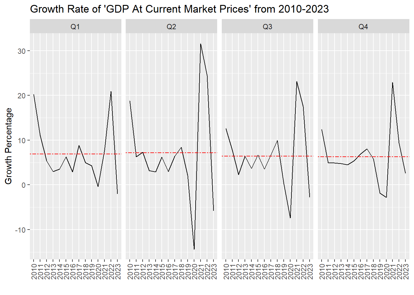
Heatmap for “GDP At Current Market Prices”
heatmap <- ggplot(GDP, aes(x = Year, y = Quarter, fill = Growth.Percentage)) +
  geom_tile(color = "white") +
  scale_fill_viridis() +
  labs(title = "Heatmap of 'GDP At Current Market Prices'",
       x = "Year",
       y = "Quarter",
       fill = "Growth Percentage") +
  theme_minimal() +
  theme(axis.text.x = element_text(angle = 45, vjust = 1, hjust = 1))

# Convert ggplot object to plotly object
heatmap_interactive <- ggplotly(heatmap)

# Display the interactive plot
heatmap_interactive
Demographics
Here, we are going to analyse the breakdown of goods and services of GDP. Which are :
Goods Producing Industries (“Manufacturing”, “Construction”, “Utilities”, “Other Goods Industries”)
Services Producing Industries (“Wholesale & Retail Trade”, “Transportation & Storage”, “Accommodation & Food Services”, “Information & Communications”, “Finance & Insurance”,“Real Estate, Services, Support”,“Other Services Industries”)
We are going to analyse it with Time Series Analysis, Heatmap and Horizon Plot.
Time Series Analysis
Goods Producing Industries
GDP_prod <- subset(GDP_data1, Categories %in% c("Manufacturing", "Construction", "Utilities", "Other Goods Industries"))
GDP_prod <- subset(GDP_prod, as.integer(format(Date, "%Y")) >= 2010)
point_desc <- c(paste0(
"Time: ", GDP_prod$Date,
"\nCategory: ",GDP_prod$Categories,
"\nGrowth Rate: ", GDP_prod$Growth.Percentage, "%"))
line <- ggplot(data = GDP_prod,
aes(x = Date, y = Growth.Percentage,
group = Categories,
color = Categories,
data_id = Categories)) +
geom_line_interactive(size = 0.5) +
geom_point_interactive(aes(tooltip = point_desc),
fill = "white",
size = 1,
stroke = 1,
shape = 21) +
labs(y = "Growth Rate %",
x = "Time",
title = "Time Series Analysis for Goods Producing Industries ")
girafe(ggobj = line,
width_svg = 10,
height_svg = 5 ,
options = list(
opts_hover(css = "stroke-width: 1; opacity: 1;"),
opts_hover_inv(css = "stroke-width: 1;opacity:0.1;")))Services Producing Industries
GDP_serv <- subset(GDP_data1, Categories %in% c("Wholesale & Retail Trade", "Transportation & Storage", "Accommodation & Food Services", "Information & Communications", "Finance & Insurance","Real Estate, Services, Support","Other Services Industries"))
GDP_serv <- subset(GDP_serv, as.integer(format(Date, "%Y")) >= 2010)
point_desc <- c(paste0(
"Time: ", GDP_serv$Date,
"\nCategory: ",GDP_serv$Categories,
"\nGrowth Rate: ", GDP_serv$Growth.Percentage, "%"))
line <- ggplot(data = GDP_serv,
aes(x = Date, y = Growth.Percentage,
group = Categories,
color = Categories,
data_id = Categories)) +
geom_line_interactive(size = 0.5) +
geom_point_interactive(aes(tooltip = point_desc),
fill = "white",
size = 1,
stroke = 1,
shape = 21) +
labs(y = "Growth Rate %",
x = "Time",
title = "Time Series Analysis for Services Producing Industries ")
girafe(ggobj = line,
width_svg = 10,
height_svg = 5 ,
options = list(
opts_hover(css = "stroke-width: 1; opacity: 1;"),
opts_hover_inv(css = "stroke-width: 1;opacity:0.1;")))HeatMap Analysis
Goods Producing Industries
heatmap <- ggplot(GDP_prod, aes(x = Date, y = Categories, fill = Growth.Percentage)) +
  geom_tile(color = "white") +
  scale_fill_viridis() +
  labs(title = "Heatmap of Goods Producing Industries",
       x = "Time",
       fill = "Growth Percentage") +
  theme_minimal() +
  theme(axis.text.x = element_text(angle = 45, vjust = 1, hjust = 1))

# Convert ggplot object to plotly object
heatmap_interactive <- ggplotly(heatmap)

# Display the interactive plot
heatmap_interactive
Services Producing Industries
heatmap <- ggplot(GDP_serv, aes(x = Date, y = Categories, fill = Growth.Percentage)) +
  geom_tile(color = "white") +
  scale_fill_viridis() +
  labs(title = "Heatmap of Services Producing Industries",
       x = "Time",
       fill = "Growth Percentage") +
  theme_minimal() +
  theme(axis.text.x = element_text(angle = 45, vjust = 1, hjust = 1))

# Convert ggplot object to plotly object
heatmap_interactive <- ggplotly(heatmap)

# Display the interactive plot
heatmap_interactive
Horizon Plot Analysis
Goods Producing Industries
GDP_prod$Date <- as.Date(GDP_prod$Date)
GDP_prod%>%
  ggplot() +
  geom_horizon(aes(x = Date, y=Growth.Percentage),
               origin = "midpoint",
               horizonscale = 6)+
  facet_grid(`Categories`~.) +
    theme_few() +
  scale_fill_hcl(palette = 'RdBu') +
  theme(panel.spacing.y=unit(0, "lines"), strip.text.y = element_text(
    size = 5, angle = 0, hjust = 0),
    legend.position = 'none',
    axis.text.y = element_blank(),
    axis.text.x = element_text(size=7),
    axis.title.y = element_blank(),
    axis.title.x = element_blank(),
    axis.ticks.y = element_blank(),
    panel.border = element_blank()
    ) +
    scale_x_date(expand=c(0,0), date_breaks = "1 year", date_labels = "%Y") +
  ggtitle('Horizon Plot for Goods Producing Industries ')+ theme(axis.text.x = element_text(angle = 90, vjust = 0.5))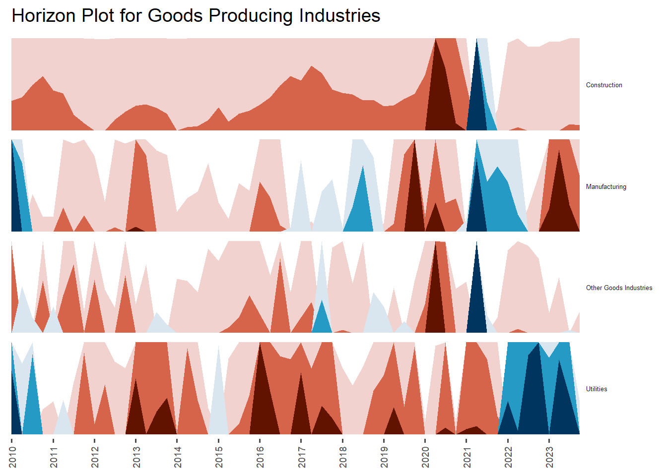
Services Producing Industries
GDP_serv$Date <- as.Date(GDP_serv$Date)
GDP_serv%>%
  ggplot() +
  geom_horizon(aes(x = Date, y=Growth.Percentage),
               origin = "midpoint",
               horizonscale = 6)+
  facet_grid(`Categories`~.) +
    theme_few() +
  scale_fill_hcl(palette = 'RdBu') +
  theme(panel.spacing.y=unit(0, "lines"), strip.text.y = element_text(
    size = 5, angle = 0, hjust = 0),
    legend.position = 'none',
    axis.text.y = element_blank(),
    axis.text.x = element_text(size=7),
    axis.title.y = element_blank(),
    axis.title.x = element_blank(),
    axis.ticks.y = element_blank(),
    panel.border = element_blank()
    ) +
    scale_x_date(expand=c(0,0), date_breaks = "1 year", date_labels = "%Y") +
  ggtitle('Horizon Plot for Services Producing Industries ')+ theme(axis.text.x = element_text(angle = 90, vjust = 0.5))
Nowcasting
Here, we are going to do a nowcasting with various forecasting method. We are going to use ARIMA or this example:
GDP1 <- GDP_data1 %>%
  select(Categories,Date,Growth.Percentage) %>%
  filter(year(Date) >= 2010, Categories == "GDP At Current Market Prices")%>%
  arrange((Date))
ts_data <- ts(GDP1$Growth.Percentage, start = c(2010, 1), end = c(2023,4),frequency = 4)
str(ts_data) Time-Series [1:56] from 2010 to 2024: 20.2 18.8 12.6 12.4 11.1 6.3 7.7 5 5.4 7.3 ...plot_ts_data <- plot_ly(x = time(ts_data), y = ts_data, type = "scatter", mode = "lines",
marker = list(color = "black"), name = "GDP Growth Rate") %>%
layout(title = "Time Series of GDP Growth",
xaxis = list(title = "Year"),
yaxis = list(title = "Growth Rate"))
print(plot_ts_data)
train_data <- window(ts_data, end = c(2023, 3))
arima_model <- auto.arima(train_data)
summary(arima_model)Series: train_data
ARIMA(1,0,0)(2,0,0)[4] with non-zero mean
Coefficients:
ar1 sar1 sar2 mean
0.7991 -0.3260 -0.4256 7.0516
s.e. 0.0890 0.1339 0.1247 1.6980
sigma^2 = 21.35: log likelihood = -161.38
AIC=332.76 AICc=333.99 BIC=342.8
Training set error measures:
ME RMSE MAE MPE MAPE MASE
Training set -0.1270704 4.449922 3.068285 -4.261285 73.15467 0.4072945
ACF1
Training set 0.05373172last_observed <- tail(train_data, 1)
forecast_result <- forecast(arima_model, h = 2, xreg = last_observed)
print(forecast_result) Point Forecast Lo 80 Hi 80 Lo 95 Hi 95
2023 Q4 -0.1515994 -6.073822 5.770623 -9.208858 8.905659
2024 Q1 4.3540393 -3.226800 11.934879 -7.239854 15.947933plot( forecast_result, xlab = "Year", ylab = "Growth Rate",
main = "Nowcasting of GDP Growth")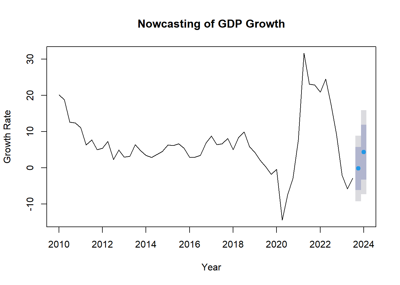
actual_value <- GDP1[GDP1$Date == "2023 Q4", "Growth.Percentage"]
print(actual_value)
# A tibble: 1 × 1
Growth.Percentage
<dbl>
1 2.6Dashboard Design Prototype
Here are the RShiny Dashboard Design Prototype for our project:
Home
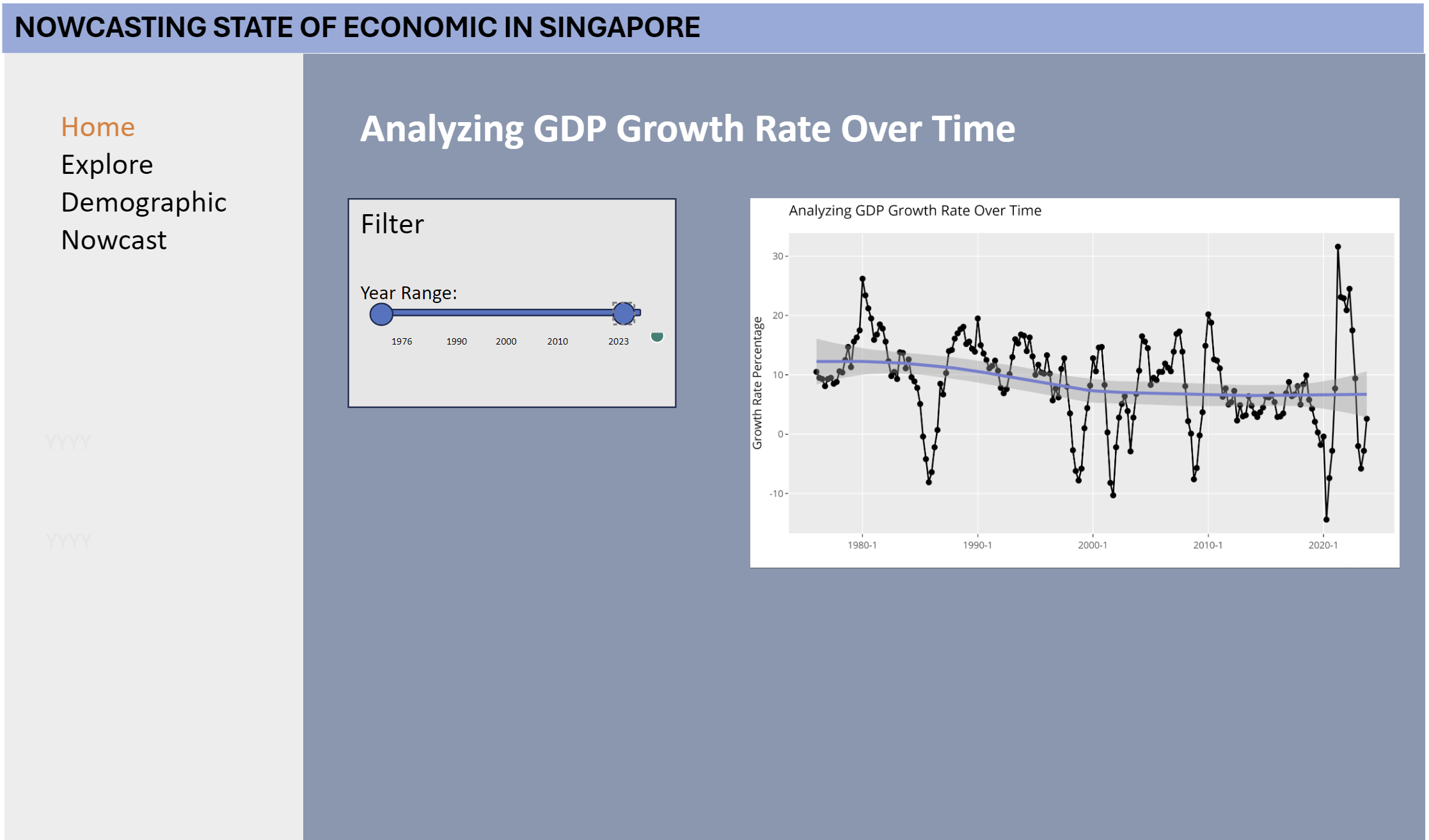
Start by selecting the year range of the historical data to be explored using the Year Range slider. The default year range is from 1976 to 2023
Upon modifications of the filters, The visualization of time series analysis for GDP Growth Rate % across time will be automatically updated.
Explore
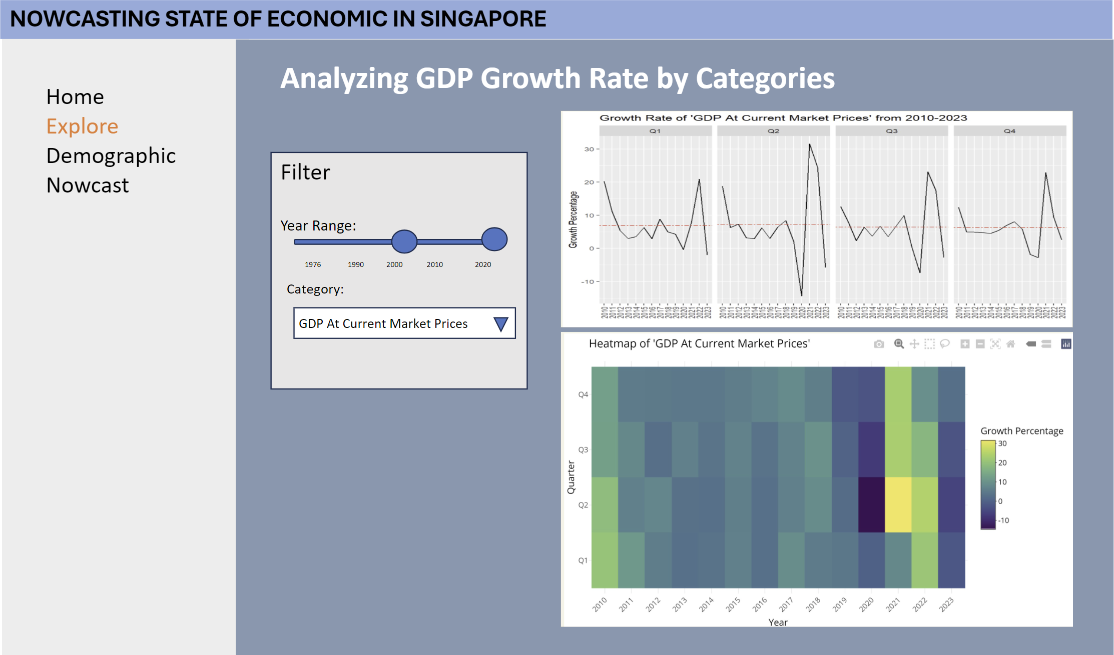
Start by selecting the year range of the historical data to be explored using the Year Range slider. The default year range is from 2010 to 2023.
Next, choose a Category to drill down into using the single-select drop-down filter for Categories. The default selection is GDP at Current Market Prices.
Upon modifications of the filters, the visualizations in the Explore tab will be automatically updated:
The visualization of cycle plot analysis for GDP Growth Rate across quarter and year. The red line indicates the average number of GDP Growth Rate that arrived on a particular Quarter.
The visualization of calendar heatmap analysis to compare the GDP Growth Rate by Quarter and Year. The lighter colour indicates a higher number % of GDP Growth Rate while the darker colour indicates a lower number % of GDP Growth Rate.
Demographic
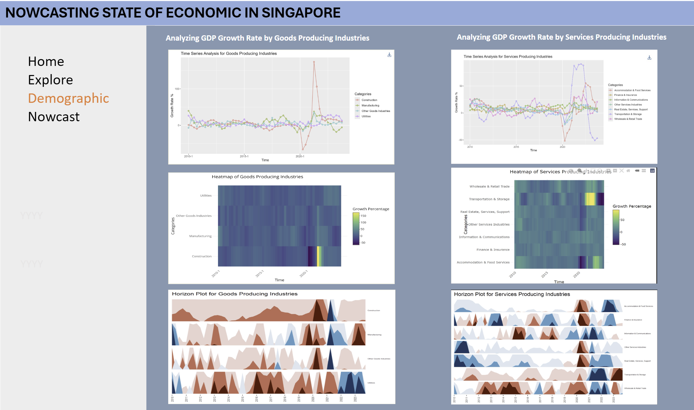
The left panel depicts the analysis by Goods Producing Industries while the right panel depicts the analysis by Services Producing Industries.
The visualizations in the Demographics tab are for the year 2010-2023:
a. The visualization of time series analysis for GDP Growth Rate by Goods Producing Industries
b. The visualization of heatmap analysis for GDP Growth Rate by Goods Producing Industries
c. The visualization of horizon pot analysis for GDP Growth Rate by Goods Producing Industries
d. The visualization of time series analysis for GDP Growth Rate by Services Producing Industries
e. The visualization of heatmap analysis for GDP Growth Rate by Services Producing Industries
f. The visualization of horizon pot analysis for GDP Growth Rate by Services Producing Industries
Nowcast
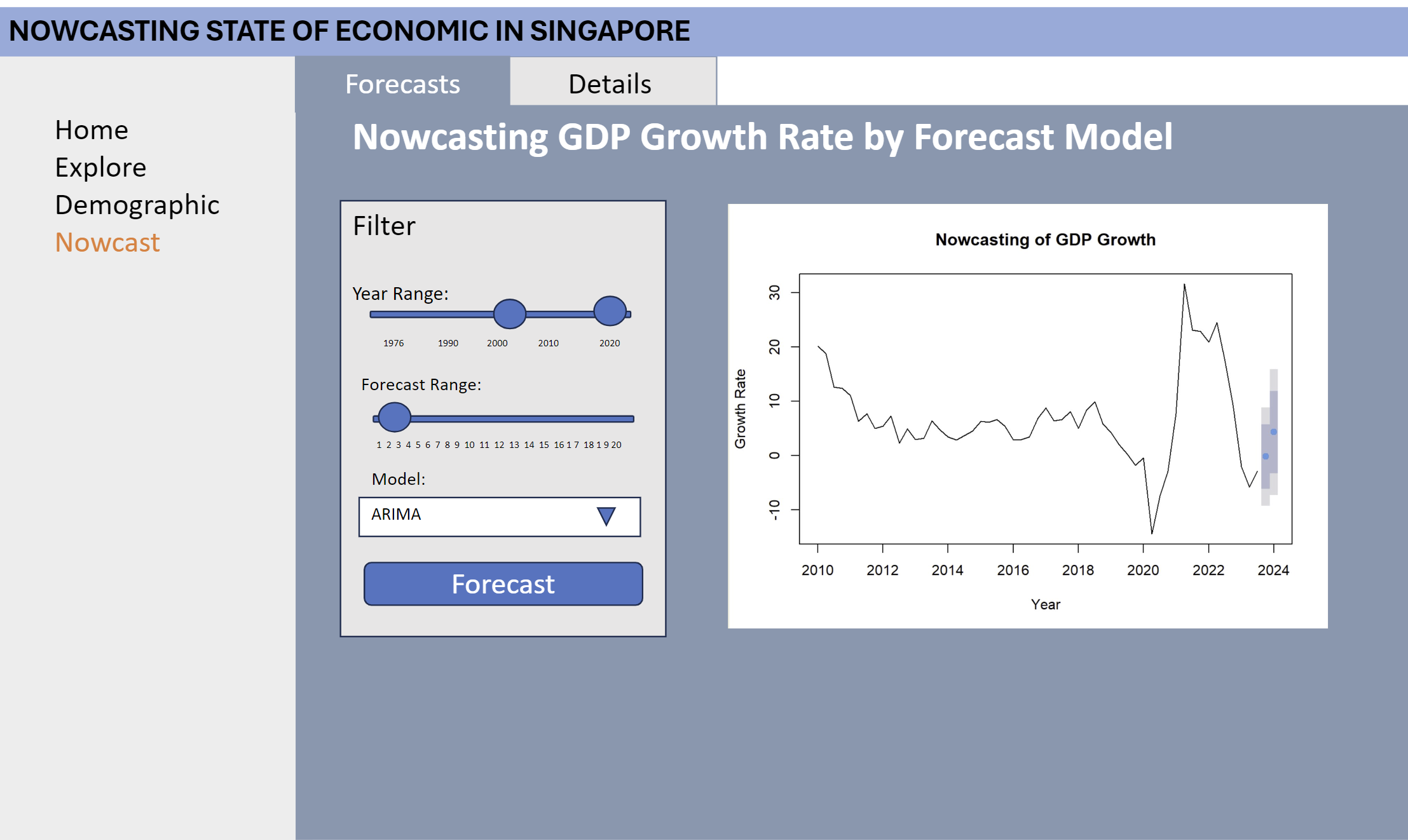
Start by selecting the year range of the historical data to be explored using the Year Range slider. The default year range is from 2010 to 2023
Then, select the forecast range of the historical data to be explored using the Forecasr Range slider. The default year range is to 2. 1 is the 2023 Q4 to make comparison between forecasted values and actual values.
Choose the Forecast Model for Nowcasting, the default model will be ARIMA.
Upon pressing the ‘Forecast’ button, the visualizations in the Nowcast will be automatically updated
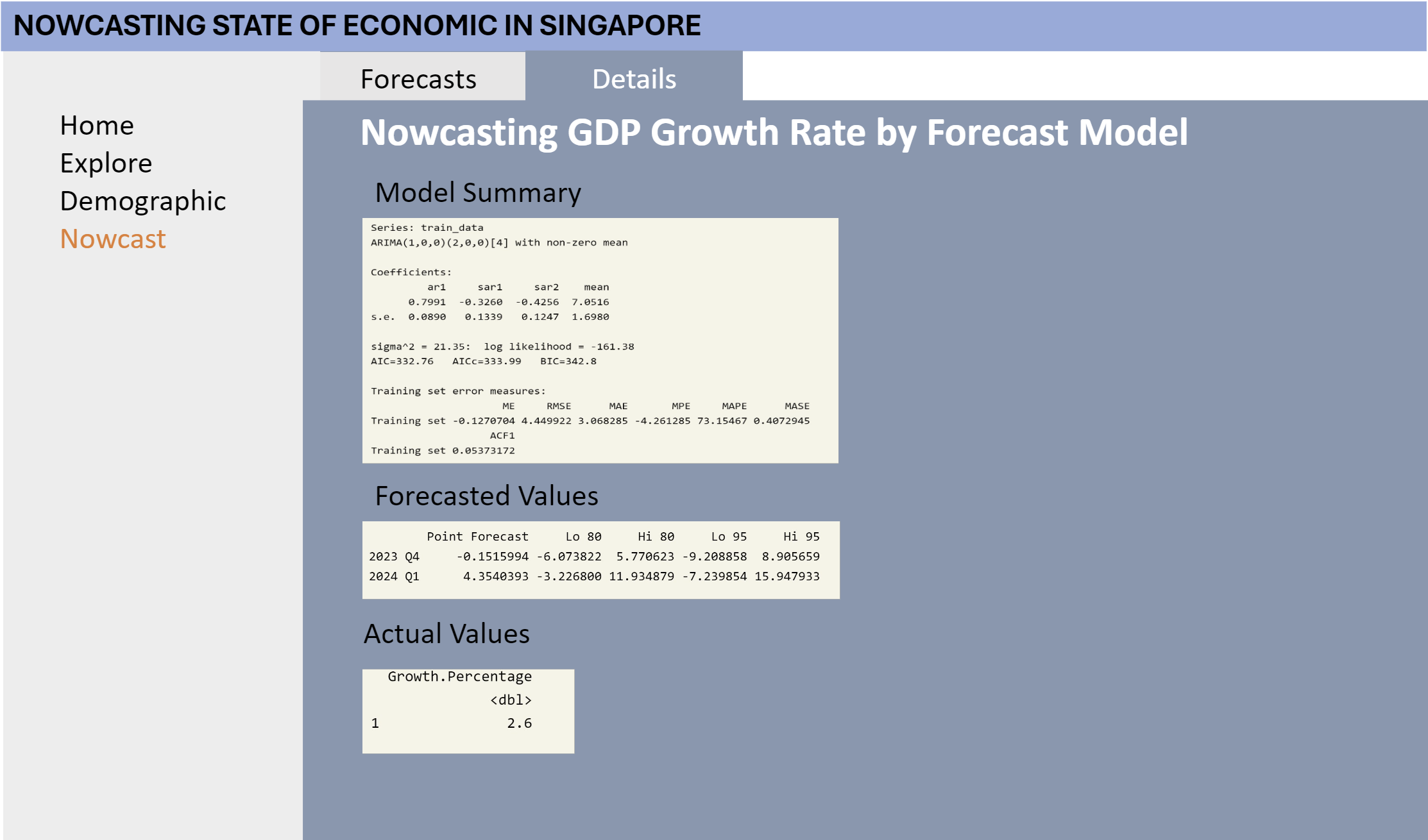
The ‘Details’ tab will show you these following three information:
Summary of the forecast Model
Forecasted Values of the forecast model
Actual Values