pacman::p_load(ggiraph, plotly,
patchwork, DT, tidyverse) Hands-on Exercise 3a: Programming Interactive Data Visualisation with R
1 Learning Outcome
In this hands-on exercise, you will learn how to create interactive data visualisation by using functions provided by ggiraph and plotlyr packages.
2 Getting Started
First, write a code chunk to check, install and launch the following R packages:
ggiraph for making ‘ggplot’ graphics interactive.
plotly, R library for plotting interactive statistical graphs.
DT provides an R interface to the JavaScript library DataTables that create interactive table on html page.
tidyverse, a family of modern R packages specially designed to support data science, analysis and communication task including creating static statistical graphs.
patchwork for combining multiple ggplot2 graphs into one figure.
The code chunk below will be used to accomplish the task.
3 Importing Data
In this section, Exam_data.csv provided will be used. Using read_csv() of readr package, import Exam_data.csv into R.
The code chunk below read_csv() of readr package is used to import Exam_data.csv data file into R and save it as an tibble data frame called exam_data.
exam_data <- read_csv("data/Exam_data.csv")4 Interactive Data Visualisation - ggiraph methods
ggiraph is an htmlwidget and a ggplot2 extension. It allows ggplot graphics to be interactive.
Interactive is made with ggplot geometries that can understand three arguments:
Tooltip: a column of data-sets that contain tooltips to be displayed when the mouse is over elements.
Onclick: a column of data-sets that contain a JavaScript function to be executed when elements are clicked.
Data_id: a column of data-sets that contain an id to be associated with elements.
If it used within a shiny application, elements associated with an id (data_id) can be selected and manipulated on client and server sides. Refer to this article for more detail explanation.
4.1 Tooltip effect with tooltip aesthetic
Below shows a typical code chunk to plot an interactive statistical graph by using ggiraph package. Notice that the code chunk consists of two parts. First, an ggplot object will be created. Next, girafe() of ggiraph will be used to create an interactive svg object.
p <- ggplot(data=exam_data,
       aes(x = MATHS)) +
  geom_dotplot_interactive(
    aes(tooltip = ID),
    stackgroups = TRUE,
    binwidth = 1,
    method = "histodot") +
  scale_y_continuous(NULL,
                     breaks = NULL)
girafe(
  ggobj = p,
  width_svg = 6,
  height_svg = 6*0.618
)
Notice that two steps are involved. First, an interactive version of ggplot2 geom (i.e. geom_dotplot_interactive()) will be used to create the basic graph. Then, girafe() will be used to generate an svg object to be displayed on an html page.
By hovering the mouse pointer on an data point of interest, the student’s ID will be displayed.
By hovering the mouse pointer on an data point of interest, the student’s ID will be displayed.
Show the code
p <- ggplot(data=exam_data,
            aes(x=MATHS)) +
  geom_dotplot_interactive(aes(tooltip=ID),
                           stackgroups = TRUE,
                           binwidth = 1,
                           method = "histodot") +
  scale_y_continuous(NULL,
                     breaks= NULL) +  #<<< null to suppress axis labels
  labs(x ="Distribution of Math Scores") +
  theme(axis.line = element_blank(),
        plot.background = element_rect(fill = "#f5f5f5", color = "#f5f5f5"))

girafe(ggobj=p,
       width_svg = 6,
       height_svg = 6*0.618)
By hovering the mouse pointer on an data point of interest, the Row Index will be displayed.
Show the code
p <- ggplot(data=exam_data,
            aes(x=MATHS)) +
  geom_dotplot_interactive(aes(tooltip=row.names(exam_data)),
                           stackgroups = TRUE,
                           binwidth = 1,
                           method = "histodot") +
  scale_y_continuous(NULL,
                     breaks= NULL)+  #<<< null to suppress axis labels
  labs(x ="Distribution of Math Scores") +
  theme(axis.line = element_blank(),
        plot.background = element_rect(fill = "#f5f5f5", color = "#f5f5f5"))

girafe(ggobj=p,
       width_svg = 6,
       height_svg = 6*0.618)
By hovering the mouse pointer on an data point of interest, the Number format (Math) will be displayed.
Show the code
p <- ggplot(data=exam_data,
            aes(x=MATHS)) +
  geom_dotplot_interactive(aes(tooltip=factor(MATHS)),
                           stackgroups = TRUE,
                           binwidth = 1,
                           method = "histodot") +
  scale_y_continuous(NULL,
                     breaks= NULL)+  #<<< null to suppress axis labels
  labs(x ="Distribution of Math Scores") +
  theme(axis.line = element_blank(),
        plot.background = element_rect(fill = "#f5f5f5", color = "#f5f5f5"))

girafe(ggobj=p,
       width_svg = 6,
       height_svg = 6*0.618)
4.2 Displaying multiple information on tooltip
The content of the tooltip can be customised by including a list object as shown in the code chunk below. We create a new column [tooltip] in exam_data by concatenating ID and Class.
The first three lines of codes in the code chunk create a new field called tooltip. At the same time, it populates text in ID and CLASS fields into the newly created field. Next, this newly created field is used as tooltip field as shown in the code of line 7.
Show the code
exam_data$tooltip <- c(paste0("Name = ",
                              exam_data$ID,
                              "\n Class = ",
                              exam_data$CLASS))

p <- ggplot(data=exam_data,
            aes(x=MATHS)) +
  geom_dotplot_interactive(aes(tooltip=tooltip),
                           stackgroups = TRUE,
                           binwidth = 1,
                           method = "histodot") +
  scale_y_continuous(NULL,
                     breaks= NULL)+  #null to suppress axis labels
  labs(x ="Distribution of Math Scores") +
  theme(axis.line = element_blank(),
        plot.background = element_rect(fill = "#f5f5f5", color = "#f5f5f5"))

girafe(ggobj=p,
       width_svg = 8,
       height_svg = 8*0.618)
By hovering the mouse pointer on an data point of interest, the student’s ID and Class will be displayed.
4.3 Customising Tooltip style
Code chunk below uses opts_tooltip() of ggiraph to customize tooltip rendering by add css declarations.
Show the code
tooltip_css <- "background-color:white; #<<
font-style:bold; color:black;" #<<

p <- ggplot(data=exam_data,
       aes(x = MATHS)) +
  geom_dotplot_interactive(
    aes(tooltip = ID),
    stackgroups = TRUE,
    binwidth = 1,
    method = "histodot") +
  scale_y_continuous(NULL,
                     breaks = NULL)
girafe(
  ggobj = p,
  width_svg = 6,
  height_svg = 6*0.618,
  options = list(    #<<
    opts_tooltip(    #<<
      css = tooltip_css)) #<<
) - Refer to Customizing girafe objects to learn more about how to customise ggiraph objects.
4.4 Displaying statistics on tooltip
Code chunk below shows an advanced way to customise tooltip. In this example, a function is used to compute 90% confident interval of the mean. The derived statistics are then displayed in the tooltip.
Show the code
tooltip <- function(y, ymax, accuracy = .01) {
  mean <- scales::number(y, accuracy = accuracy)
  sem <- scales::number(ymax - y, accuracy = accuracy)
  paste("Mean maths scores:", mean, "+/-", sem)
}

gg_point <- ggplot(data=exam_data,
                   aes(x = RACE),
) +
  stat_summary(aes(y = MATHS,
                   tooltip = after_stat(
                     tooltip(y, ymax))),
    fun.data = "mean_se",
    geom = GeomInteractiveCol,
    fill = "light blue"
  ) +
  stat_summary(aes(y = MATHS),
    fun.data = mean_se,
    geom = "errorbar", width = 0.2, size = 0.2
  )

girafe(ggobj = gg_point,
       width_svg = 8,
       height_svg = 8*0.618)
4.5 Hover effect with data_id aesthetic
Code chunk below shows the second interactive feature of ggiraph, namely data_id.
Show the code
p <- ggplot(data=exam_data,
       aes(x = MATHS)) +
  geom_dotplot_interactive(
    aes(data_id = CLASS),
    stackgroups = TRUE,
    binwidth = 1,
    method = "histodot") +
  scale_y_continuous(NULL,
                     breaks = NULL)
girafe(
  ggobj = p,
  width_svg = 6,
  height_svg = 6*0.618
)
Interactivity: Elements associated with a data_id (i.e CLASS) will be highlighted upon mouse over.
Note that the default value of the hover css is hover_css = “fill:orange;”.
4.5.1 Styling hover effect
In the code chunk below, css codes are used to change the highlighting effect.
Show the code
p <- ggplot(data=exam_data,
       aes(x = MATHS)) +
  geom_dotplot_interactive(
    aes(data_id = CLASS),
    stackgroups = TRUE,
    binwidth = 1,
    method = "histodot") +
  scale_y_continuous(NULL,
                     breaks = NULL)
girafe(
  ggobj = p,
  width_svg = 6,
  height_svg = 6*0.618,
  options = list(
    opts_hover(css = "fill: #202020;"),
    opts_hover_inv(css = "opacity:0.2;")
  )
)
Interactivity: Elements associated with a data_id (i.e CLASS) will be highlighted upon mouse over.
Note: Different from previous example, in this example the ccs customisation request are encoded directly.
4.6 Combining tooltip and hover effect
There are time that we want to combine tooltip and hover effect on the interactive statistical graph as shown in the code chunk below.
Show the code
p <- ggplot(data=exam_data,
       aes(x = MATHS)) +
  geom_dotplot_interactive(
    aes(tooltip = CLASS,
        data_id = CLASS),
    stackgroups = TRUE,
    binwidth = 1,
    method = "histodot") +
  scale_y_continuous(NULL,
                     breaks = NULL)
girafe(
  ggobj = p,
  width_svg = 6,
  height_svg = 6*0.618,
  options = list(
    opts_hover(css = "fill: #202020;"),
    opts_hover_inv(css = "opacity:0.2;")
  )
)
Interactivity: Elements associated with a data_id (i.e CLASS) will be highlighted upon mouse over. At the same time, the tooltip will show the CLASS.
5 Click Effect with onclick
onclick argument of ggiraph provides hotlink interactivity on the web.
The code chunk below shown an example of onclick.
Show the code
exam_data$onclick <- sprintf("window.open(\"%s%s\")",
"https://www.moe.gov.sg/schoolfinder?journey=Primary%20school",
as.character(exam_data$ID))

p <- ggplot(data=exam_data,
       aes(x = MATHS)) +
  geom_dotplot_interactive(
    aes(onclick = onclick),
    stackgroups = TRUE,
    binwidth = 1,
    method = "histodot") +
  scale_y_continuous(NULL,
                     breaks = NULL)
girafe(
  ggobj = p,
  width_svg = 6,
  height_svg = 6*0.618)
Interactivity: Web document link with a data object will be displayed on the web browser upon mouse click.
Warning: Note that click actions must be a string column in the dataset containing valid javascript instructions.
6 Coordinated Multiple Views with ggiraph
Coordinated multiple views methods has been implemented in the data visualisation below.
Show the code
p1 <- ggplot(data=exam_data,
       aes(x = MATHS)) +
  geom_dotplot_interactive(
    aes(data_id = ID),
    stackgroups = TRUE,
    binwidth = 1,
    method = "histodot") +
  coord_cartesian(xlim=c(0,100)) +
  scale_y_continuous(NULL,
                     breaks = NULL)

p2 <- ggplot(data=exam_data,
       aes(x = ENGLISH)) +
  geom_dotplot_interactive(
    aes(data_id = ID),
    stackgroups = TRUE,
    binwidth = 1,
    method = "histodot") +
  coord_cartesian(xlim=c(0,100)) +
  scale_y_continuous(NULL,
                     breaks = NULL)

girafe(code = print(p1 + p2),
       width_svg = 6,
       height_svg = 3,
       options = list(
         opts_hover(css = "fill: #202020;"),
         opts_hover_inv(css = "opacity:0.2;")
         )
       )
Notice that when a data point of one of the dotplot is selected, the corresponding data point ID on the second data visualisation will be highlighted too.
In order to build a coordinated multiple views as shown in the example above, the following programming strategy will be used:
Appropriate interactive functions of ggiraph will be used to create the multiple views.
patchwork function of patchwork package will be used inside girafe function to create the interactive coordinated multiple views.
The data_id aesthetic is critical to link observations between plots and the tooltip aesthetic is optional but nice to have when mouse over a point.
7 Interactive Data Visualisation - plotly methods!
Plotly’s R graphing library create interactive web graphics from ggplot2 graphs and/or a custom interface to the (MIT-licensed) JavaScript library plotly.js inspired by the grammar of graphics. Different from other plotly platform, plot.R is free and open source.
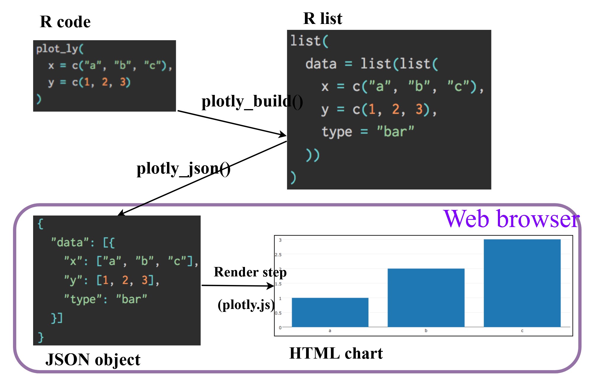
There are two ways to create interactive graph by using plotly, they are:
by using plot_ly(), and
by using ggplotly()
8 Creating an interactive scatter plot: plot_ly() method
The tabset below shows an example a basic interactive plot created by using plot_ly().
plot_ly(data = exam_data, x = ~MATHS, y = ~ENGLISH)8.1 Working with visual variable: plot_ly() method
In the code chunk below, color argument is mapped to a qualitative visual variable (i.e. RACE).
Show the code
plot_ly(data = exam_data,
        x = ~ENGLISH,
        y = ~MATHS,
        color = ~RACE)
8.2 Creating an interactive scatter plot: ggplotly() method
The code chunk below plots an interactive scatter plot by using ggplotly().
Show the code
p <- ggplot(data=exam_data,
            aes(x = MATHS,
                y = ENGLISH)) +
  geom_point(size=1) +
  coord_cartesian(xlim=c(0,100),
                  ylim=c(0,100))
ggplotly(p)
8.3 Coordinated Multiple Views with plotly
The creation of a coordinated linked plot by using plotly involves three steps:
highlight_key()of plotly package is used as shared data.two scatterplots will be created by using ggplot2 functions.
lastly, subplot() of plotly package is used to place them next to each other side-by-side.
Show the code
d <- highlight_key(exam_data)
p1 <- ggplot(data=d,
            aes(x = MATHS,
                y = ENGLISH)) +
  geom_point(size=1) +
  coord_cartesian(xlim=c(0,100),
                  ylim=c(0,100))

p2 <- ggplot(data=d,
            aes(x = MATHS,
                y = SCIENCE)) +
  geom_point(size=1) +
  coord_cartesian(xlim=c(0,100),
                  ylim=c(0,100))
subplot(ggplotly(p1),
        ggplotly(p2))
Thing to learn from the code chunk:
highlight_key()simply creates an object of class crosstalk::SharedData.Visit this link to learn more about crosstalk,
9 Interactive Data Visualisation - crosstalk methods!
Crosstalk is an add-on to the htmlwidgets package. It extends htmlwidgets with a set of classes, functions, and conventions for implementing cross-widget interactions (currently, linked brushing and filtering).
9.1 Interactive Data Table: DT package
A wrapper of the JavaScript Library DataTables
Data objects in R can be rendered as HTML tables using the JavaScript library ‘DataTables’ (typically via R Markdown or Shiny).
DT::datatable(exam_data, class= "compact")9.2 Linked brushing: crosstalk method
Code chunk below is used to implement the coordinated brushing shown above.
Show the code
d <- highlight_key(exam_data)
p <- ggplot(d,
            aes(ENGLISH,
                MATHS)) +
  geom_point(size=1) +
  coord_cartesian(xlim=c(0,100),
                  ylim=c(0,100))

gg <- highlight(ggplotly(p),
                "plotly_selected")

crosstalk::bscols(gg,
                  DT::datatable(d),
                  widths = 5)
Things to learn from the code chunk:
highlight() is a function of plotly package. It sets a variety of options for brushing (i.e., highlighting) multiple plots. These options are primarily designed for linking multiple plotly graphs, and may not behave as expected when linking plotly to another htmlwidget package via crosstalk. In some cases, other htmlwidgets will respect these options, such as persistent selection in leaflet.
bscols() is a helper function of crosstalk package. It makes it easy to put HTML elements side by side. It can be called directly from the console but is especially designed to work in an R Markdown document. Warning: This will bring in all of Bootstrap!.
10 Reference
10.1 ggiraph
This link provides online version of the reference guide and several useful articles. Use this link to download the pdf version of the reference guide.
This link provides code example on how ggiraph is used to interactive graphs for Swiss Olympians - the solo specialists.
10.2 plotly for R
A collection of plotly R graphs are available via this link.
Carson Sievert (2020) Interactive web-based data visualization with R, plotly, and shiny, Chapman and Hall/CRC is the best resource to learn plotly for R. The online version is available via this link
Plotly R Figure Reference provides a comprehensive discussion of each visual representations.
Plotly R Library Fundamentals is a good place to learn the fundamental features of Plotly’s R API.
Visit this link for a very interesting implementation of gganimate by your senior.