pacman::p_load(seriation, dendextend, heatmaply, tidyverse)Hands-on Exercise 5c: Visual Multivariate Analysis with Heatmap
Overview
Heatmaps visualise data through variations in colouring. When applied to a tabular format, heatmaps are useful for cross-examining multivariate data, through placing variables in the columns and observation (or records) in rowa and colouring the cells within the table. Heatmaps are good for showing variance across multiple variables, revealing any patterns, displaying whether any variables are similar to each other, and for detecting if any correlations exist in-between them.
In this hands-on exercise, you will gain hands-on experience on using R to plot static and interactive heatmap for visualising and analysing multivariate data.
Installing and Launching R Packages
Before you get started, you are required:
- to start a new R project, and
- to create a new R Markdown document.
Next, you will use the code chunk below to install and launch seriation, heatmaply, dendextend and tidyverse in RStudio.
Importing and Preparing The Data Set
In this hands-on exercise, the data of World Happines 2018 report will be used. The data set is downloaded from here. The original data set is in Microsoft Excel format. It has been extracted and saved in csv file called WHData-2018.csv.
Importing the data set
In the code chunk below, read_csv() of readr is used to import WHData-2018.csv into R and parsed it into tibble R data frame format.
wh <- read_csv("data/WHData-2018.csv")The output tibbled data frame is called wh.
Preparing the data
Next, we need to change the rows by country name instead of row number by using the code chunk below
row.names(wh) <- wh$CountryNotice that the row number has been replaced into the country name.
Transforming the data frame into a matrix
The data was loaded into a data frame, but it has to be a data matrix to make your heatmap.
The code chunk below will be used to transform wh data frame into a data matrix.
wh1 <- dplyr::select(wh, c(3, 7:12))
wh_matrix <- data.matrix(wh)
Notice that wh_matrix is in R matrix format.
Static Heatmap
There are many R packages and functions can be used to drawing static heatmaps, they are:
- heatmap()of R stats package. It draws a simple heatmap.
- heatmap.2() of gplots R package. It draws an enhanced heatmap compared to the R base function.
- pheatmap() of pheatmap R package. pheatmap package also known as Pretty Heatmap. The package provides functions to draws pretty heatmaps and provides more control to change the appearance of heatmaps.
- ComplexHeatmap package of R/Bioconductor package. The package draws, annotates and arranges complex heatmaps (very useful for genomic data analysis). The full reference guide of the package is available here.
- superheat package: A Graphical Tool for Exploring Complex Datasets Using Heatmaps. A system for generating extendable and customizable heatmaps for exploring complex datasets, including big data and data with multiple data types. The full reference guide of the package is available here.
In this section, you will learn how to plot static heatmaps by using heatmap() of R Stats package.
heatmap() of R Stats
In this sub-section, we will plot a heatmap by using heatmap() of Base Stats. The code chunk is given below.
wh_heatmap <- heatmap(wh_matrix,
                      Rowv=NA, Colv=NA)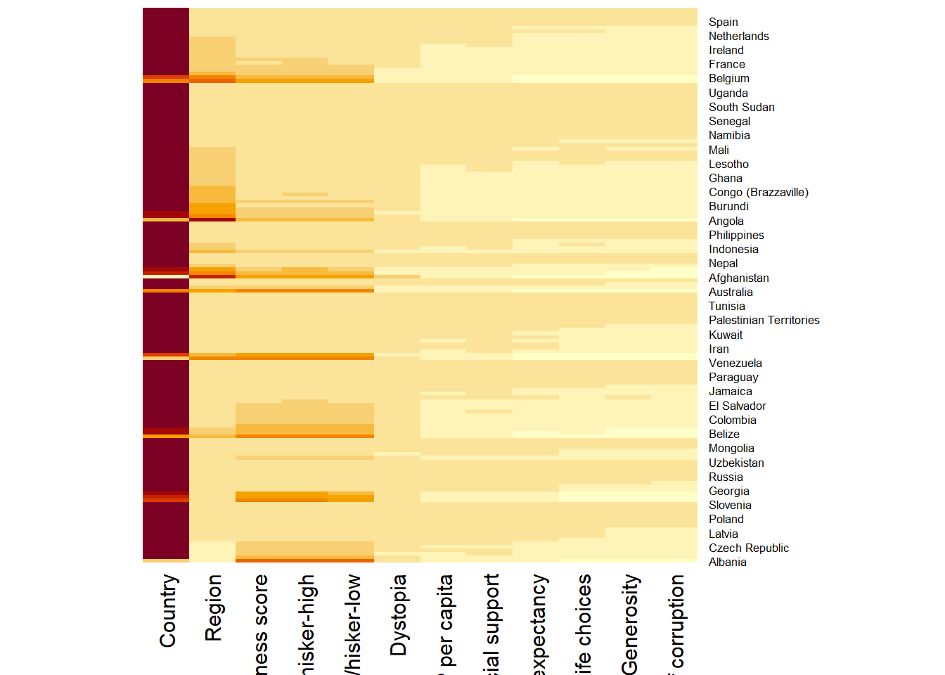
Note:
- By default, heatmap() plots a cluster heatmap. The arguments Rowv=NA and Colv=NA are used to switch off the option of plotting the row and column dendrograms.
To plot a cluster heatmap, we just have to use the default as shown in the code chunk below.
wh_heatmap <- heatmap(wh_matrix)
Note:
- The order of both rows and columns is different compare to the native wh_matrix. This is because heatmap do a reordering using clusterisation: it calculates the distance between each pair of rows and columns and try to order them by similarity. Moreover, the corresponding dendrogram are provided beside the heatmap.
Here, red cells denotes small values, and red small ones. This heatmap is not really informative. Indeed, the Happiness Score variable have relatively higher values, what makes that the other variables with small values all look the same. Thus, we need to normalize this matrix. This is done using the scale argument. It can be applied to rows or to columns following your needs.
The code chunk below normalises the matrix column-wise.
wh_heatmap <- heatmap(wh_matrix,
                      scale="column",
                      cexRow = 0.6,
                      cexCol = 0.8,
                      margins = c(10, 4))
Notice that the values are scaled now. Also note that margins argument is used to ensure that the entire x-axis labels are displayed completely and, cexRow and cexCol arguments are used to define the font size used for y-axis and x-axis labels respectively.
Creating Interactive Heatmap
heatmaply is an R package for building interactive cluster heatmap that can be shared online as a stand-alone HTML file. It is designed and maintained by Tal Galili.
Before we get started, you should review the Introduction to Heatmaply to have an overall understanding of the features and functions of Heatmaply package. You are also required to have the user manualof the package handy with you for reference purposes.
In this section, you will gain hands-on experience on using heatmaply to design an interactive cluster heatmap. We will still use the wh_matrix as the input data.
Working with heatmaply
heatmaply(mtcars)The code chunk below shows the basic syntax needed to create n interactive heatmap by using heatmaply package.
heatmaply(wh_matrix[, -c(1, 2, 4, 5)])Note that:
- Different from heatmap(), for heatmaply() the default horizontal dendrogram is placed on the left hand side of the heatmap.
- The text label of each raw, on the other hand, is placed on the right hand side of the heat map.
- When the x-axis marker labels are too long, they will be rotated by 135 degree from the north.
Data trasformation
When analysing multivariate data set, it is very common that the variables in the data sets includes values that reflect different types of measurement. In general, these variables’ values have their own range. In order to ensure that all the variables have comparable values, data transformation are commonly used before clustering.
Three main data transformation methods are supported by heatmaply(), namely: scale, normalise and percentilse.
Scaling method
- When all variables are came from or assumed to come from some normal distribution, then scaling (i.e.: subtract the mean and divide by the standard deviation) would bring them all close to the standard normal distribution.
- In such a case, each value would reflect the distance from the mean in units of standard deviation.
- The scale argument in heatmaply() supports column and row scaling.
The code chunk below is used to scale variable values columewise.
heatmaply(wh_matrix[, -c(1, 2, 4, 5)],
          scale = "column")
Normalising method
- When variables in the data comes from possibly different (and non-normal) distributions, the normalize function can be used to bring data to the 0 to 1 scale by subtracting the minimum and dividing by the maximum of all observations.
- This preserves the shape of each variable’s distribution while making them easily comparable on the same “scale”.
Different from Scaling, the normalise method is performed on the input data set i.e. wh_matrix as shown in the code chunk below.
heatmaply(normalize(wh_matrix[, -c(1, 2, 4, 5)]))Percentising method
- This is similar to ranking the variables, but instead of keeping the rank values, divide them by the maximal rank.
- This is done by using the ecdf of the variables on their own values, bringing each value to its empirical percentile.
- The benefit of the percentize function is that each value has a relatively clear interpretation, it is the percent of observations that got that value or below it.
Similar to Normalize method, the Percentize method is also performed on the input data set i.e. wh_matrix as shown in the code chunk below.
heatmaply(percentize(wh_matrix[, -c(1, 2, 4, 5)]))Clustering algorithm
heatmaply supports a variety of hierarchical clustering algorithm. The main arguments provided are:
- distfun: function used to compute the distance (dissimilarity) between both rows and columns. Defaults to dist. The options “pearson”, “spearman” and “kendall” can be used to use correlation-based clustering, which uses as.dist(1 - cor(t(x))) as the distance metric (using the specified correlation method).
- hclustfun: function used to compute the hierarchical clustering when Rowv or Colv are not dendrograms. Defaults to hclust.
- dist_method default is NULL, which results in “euclidean” to be used. It can accept alternative character strings indicating the method to be passed to distfun. By default distfun is “dist”” hence this can be one of “euclidean”, “maximum”, “manhattan”, “canberra”, “binary” or “minkowski”.
- hclust_method default is NULL, which results in “complete” method to be used. It can accept alternative character strings indicating the method to be passed to hclustfun. By default hclustfun is hclust hence this can be one of “ward.D”, “ward.D2”, “single”, “complete”, “average” (= UPGMA), “mcquitty” (= WPGMA), “median” (= WPGMC) or “centroid” (= UPGMC).
In general, a clustering model can be calibrated either manually or statistically.
Manual approach
In the code chunk below, the heatmap is plotted by using hierachical clustering algorithm with “Euclidean distance” and “ward.D” method.
heatmaply(normalize(wh_matrix[, -c(1, 2, 4, 5)]),
          dist_method = "euclidean",
          hclust_method = "ward.D")
Statistical approach
In order to determine the best clustering method and number of cluster the dend_expend() and find_k() functions of dendextend package will be used.
First, the dend_expend() will be used to determine the recommended clustering method to be used.
wh_d <- dist(normalize(wh_matrix[, -c(1, 2, 4, 5)]), method = "euclidean")
dend_expend(wh_d)[[3]]
dist_methods hclust_methods optim
1 unknown ward.D 0.6137851
2 unknown ward.D2 0.6289186
3 unknown single 0.4774362
4 unknown complete 0.6434009
5 unknown average 0.6701688
6 unknown mcquitty 0.5020102
7 unknown median 0.5901833
8 unknown centroid 0.6338734The output table shows that “average” method should be used because it gave the high optimum value.
Next, find_k() is used to determine the optimal number of cluster.
wh_clust <- hclust(wh_d, method = "average")
num_k <- find_k(wh_clust)
plot(num_k)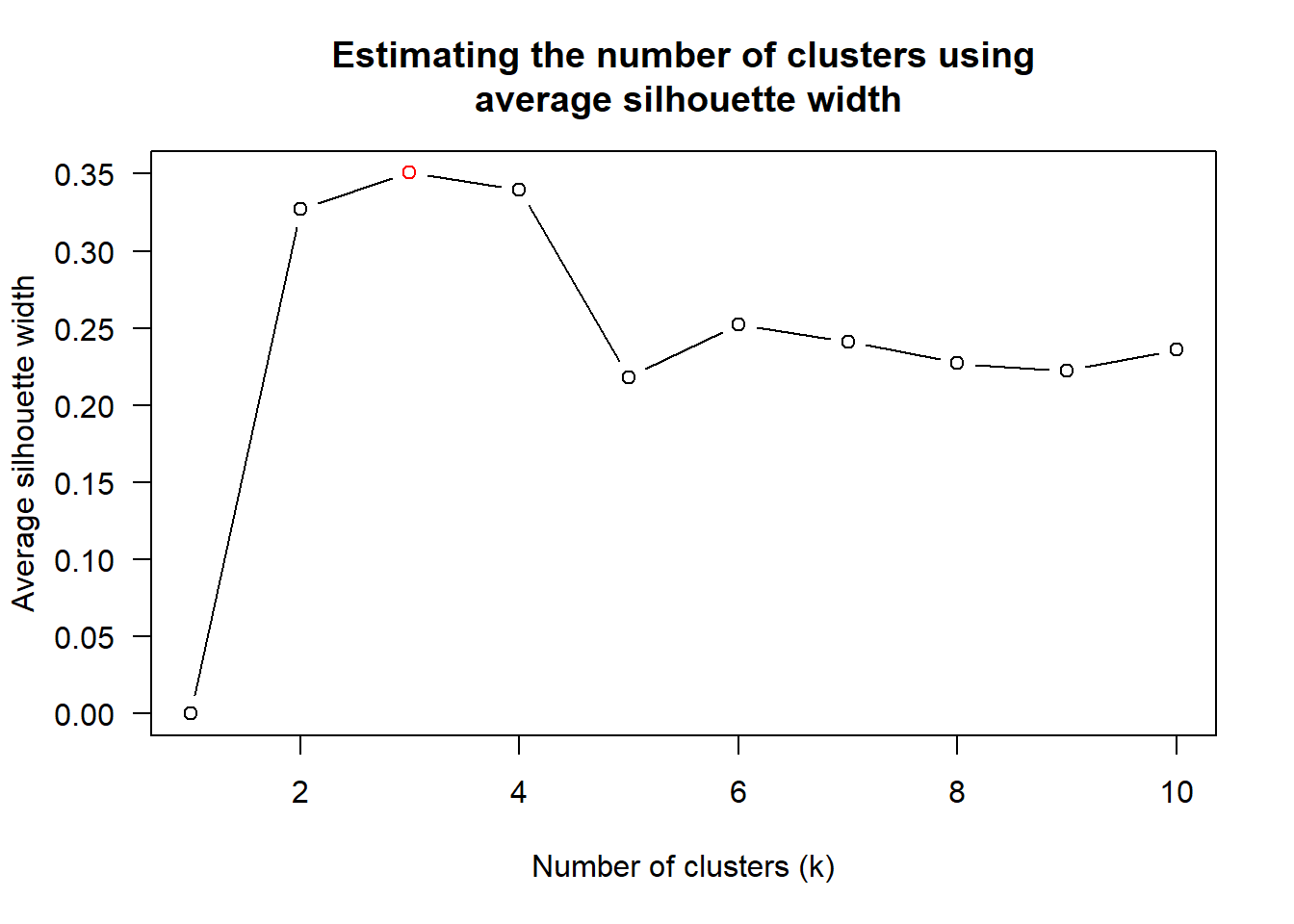
Figure above shows that k=3 would be good.
With reference to the statistical analysis results, we can prepare the code chunk as shown below.
heatmaply(normalize(wh_matrix[, -c(1, 2, 4, 5)]),
          dist_method = "euclidean",
          hclust_method = "average",
          k_row = 3)
Seriation
One of the problems with hierarchical clustering is that it doesn’t actually place the rows in a definite order, it merely constrains the space of possible orderings. Take three items A, B and C. If you ignore reflections, there are three possible orderings: ABC, ACB, BAC. If clustering them gives you ((A+B)+C) as a tree, you know that C can’t end up between A and B, but it doesn’t tell you which way to flip the A+B cluster. It doesn’t tell you if the ABC ordering will lead to a clearer-looking heatmap than the BAC ordering.
heatmaply uses the seriation package to find an optimal ordering of rows and columns. Optimal means to optimize the Hamiltonian path length that is restricted by the dendrogram structure. This, in other words, means to rotate the branches so that the sum of distances between each adjacent leaf (label) will be minimized. This is related to a restricted version of the travelling salesman problem.
Here we meet our first seriation algorithm: Optimal Leaf Ordering (OLO). This algorithm starts with the output of an agglomerative clustering algorithm and produces a unique ordering, one that flips the various branches of the dendrogram around so as to minimize the sum of dissimilarities between adjacent leaves. Here is the result of applying Optimal Leaf Ordering to the same clustering result as the heatmap above.
heatmaply(normalize(wh_matrix[, -c(1, 2, 4, 5)]),
          seriate = "OLO")
The default options is “OLO” (Optimal leaf ordering) which optimizes the above criterion (in O(n^4)). Another option is “GW” (Gruvaeus and Wainer) which aims for the same goal but uses a potentially faster heuristic.
heatmaply(normalize(wh_matrix[, -c(1, 2, 4, 5)]),
          seriate = "GW")
The option “mean” gives the output we would get by default from heatmap functions in other packages such as gplots::heatmap.2.
heatmaply(normalize(wh_matrix[, -c(1, 2, 4, 5)]),
          seriate = "mean")
The option “none” gives us the dendrograms without any rotation that is based on the data matrix.
heatmaply(normalize(wh_matrix[, -c(1, 2, 4, 5)]),
          seriate = "none")
Working with colour palettes
The default colour palette uses by heatmaply is viridis. heatmaply users, however, can use other colour palettes in order to improve the aestheticness and visual friendliness of the heatmap.
In the code chunk below, the Blues colour palette of rColorBrewer is used
heatmaply(normalize(wh_matrix[, -c(1, 2, 4, 5)]),
          seriate = "none",
          colors = Blues)
The finishing touch
Beside providing a wide collection of arguments for meeting the statistical analysis needs, heatmaply also provides many plotting features to ensure cartographic quality heatmap can be produced.
In the code chunk below the following arguments are used:
- k_row is used to produce 5 groups.
- margins is used to change the top margin to 60 and row margin to 200.
- fontsizw_row and fontsize_col are used to change the font size for row and column labels to 4.
- main is used to write the main title of the plot.
- xlab and ylab are used to write the x-axis and y-axis labels respectively.
heatmaply(normalize(wh_matrix[, -c(1, 2, 4, 5)]),
          Colv=NA,
          seriate = "none",
          colors = Blues,
          k_row = 5,
          margins = c(NA,200,60,NA),
          fontsize_row = 4,
          fontsize_col = 5,
          main="World Happiness Score and Variables by Country, 2018 \nDataTransformation using Normalise Method",
          xlab = "World Happiness Indicators",
          ylab = "World Countries"
          )