pacman::p_load(lubridate, ggthemes, reactable,
reactablefmtr, gt, gtExtras, tidyverse, RODBC, svglite, dataui)Hands-on Execise 10: Information Dashboard Design: R methods
Overview
By the end of this hands-on exercise, you will be able to:
- create bullet chart by using ggplot2,
- create sparklines by using ggplot2 ,
- build industry standard dashboard by using R Shiny.
Getting started
For the purpose of this hands-on exercise, the following R packages will be used.
- tidyverse provides a collection of functions for performing data science task such as importing, tidying, wrangling data and visualising data. It is not a single package but a collection of modern R packages including but not limited to readr, tidyr, dplyr, ggplot, tibble, stringr, forcats and purrr.
- lubridate provides functions to work with dates and times more efficiently.
- ggthemes is an extension of ggplot2. It provides additional themes beyond the basic themes of ggplot2.
- gtExtras provides some additional helper functions to assist in creating beautiful tables with gt, an R package specially designed for anyone to make wonderful-looking tables using the R programming language.
- reactable provides functions to create interactive data tables for R, based on the React Table library and made with reactR.
- reactablefmtr provides various features to streamline and enhance the styling of interactive reactable tables with easy-to-use and highly-customizable functions and themes.
Importing Microsoft Access database
The data set
For the purpose of this study, a personal database in Microsoft Access mdb format called Coffee Chain will be used.
Importing database into R
In the code chunk below, odbcConnectAccess() of RODBC package is used used to import a database query table into R.
library(RODBC)
con <- odbcConnectAccess2007('data/Coffee Chain.mdb')
coffeechain <- sqlFetch(con, 'CoffeeChain Query')
write_rds(coffeechain, "data/CoffeeChain.rds")
odbcClose(con)
Note: Before running the code chunk, you need to change the R system to 32bit version. This is because the odbcConnectAccess() is based on 32bit and not 64bit
Data Preparation
The code chunk below is used to import CoffeeChain.rds into R.
coffeechain <- read_rds("data/rds/CoffeeChain.rds")Note: This step is optional if coffeechain is already available in R.
The code chunk below is used to aggregate Sales and Budgeted Sales at the Product level.
product <- coffeechain %>%
  group_by(`Product`) %>%
  summarise(`target` = sum(`Budget Sales`),
            `current` = sum(`Sales`)) %>%
  ungroup()
Bullet chart in ggplot2
The code chunk below is used to plot the bullet charts using ggplot2 functions.
ggplot(product, aes(Product, current)) +
  geom_col(aes(Product, max(target) * 1.01),
           fill="grey85", width=0.85) +
  geom_col(aes(Product, target * 0.75),
           fill="grey60", width=0.85) +
  geom_col(aes(Product, target * 0.5),
           fill="grey50", width=0.85) +
  geom_col(aes(Product, current),
           width=0.35,
           fill = "black") +
  geom_errorbar(aes(y = target,
                    x = Product,
                    ymin = target,
                    ymax= target),
                width = .4,
                colour = "red",
                size = 1) +
  coord_flip()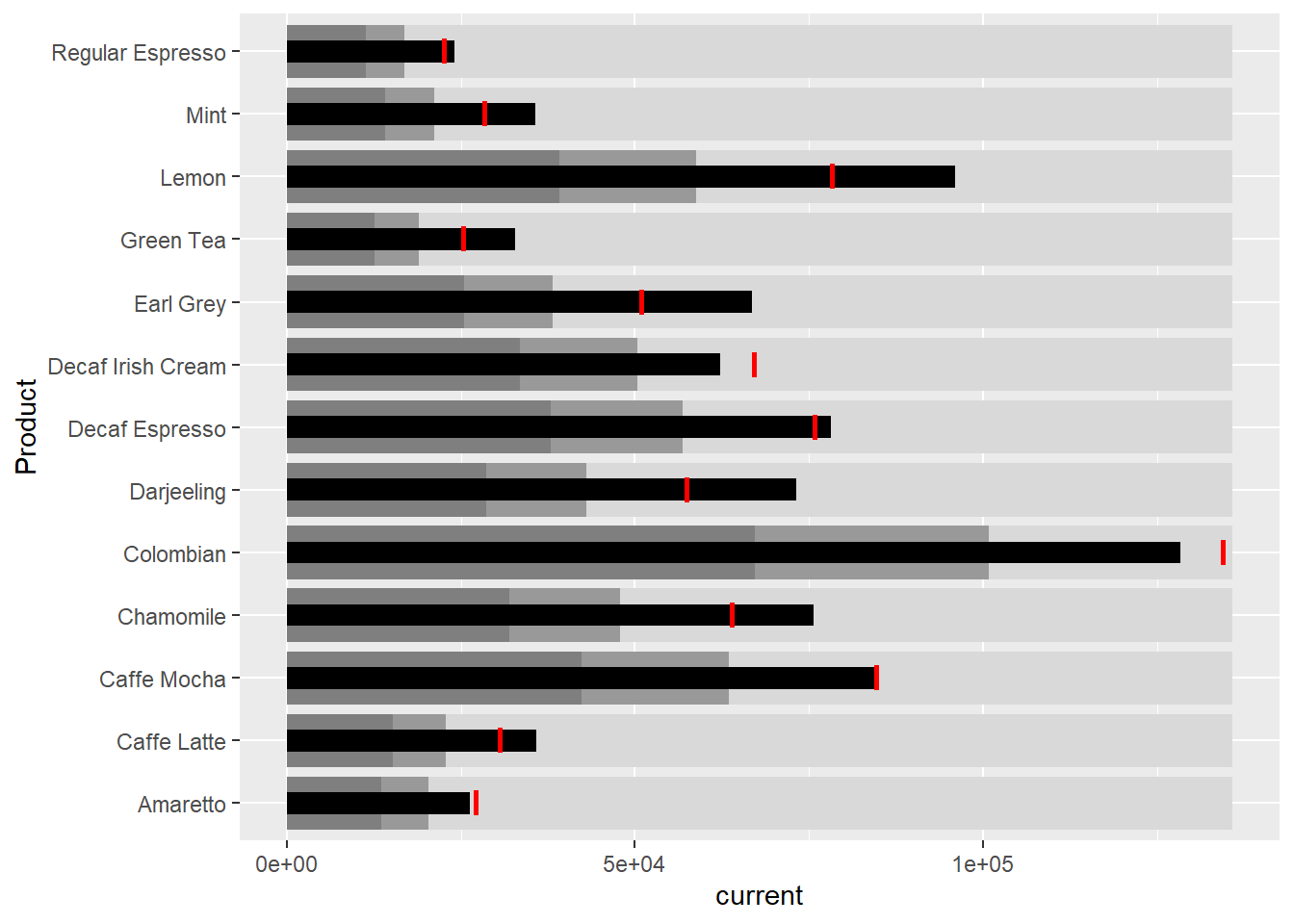
Plotting sparklines using ggplot2
In this section, you will learn how to plot sparklines by using ggplot2.
Preparing the data
sales_report <- coffeechain %>%
  filter(Date >= "2013-01-01") %>%
  mutate(Month = month(Date)) %>%
  group_by(Month, Product) %>%
  summarise(Sales = sum(Sales)) %>%
  ungroup() %>%
  select(Month, Product, Sales)
The code chunk below is used to compute the minimum, maximum and end othe the month sales.
mins <- group_by(sales_report, Product) %>%
  slice(which.min(Sales))
maxs <- group_by(sales_report, Product) %>%
  slice(which.max(Sales))
ends <- group_by(sales_report, Product) %>%
  filter(Month == max(Month))
The code chunk below is used to compute the 25 and 75 quantiles.
quarts <- sales_report %>%
  group_by(Product) %>%
  summarise(quart1 = quantile(Sales,
                              0.25),
            quart2 = quantile(Sales,
                              0.75)) %>%
  right_join(sales_report)
sparklines in ggplot2
The code chunk used.
ggplot(sales_report, aes(x=Month, y=Sales)) +
  facet_grid(Product ~ ., scales = "free_y") +
  geom_ribbon(data = quarts, aes(ymin = quart1, max = quart2),
              fill = 'grey90') +
  geom_line(size=0.3) +
  geom_point(data = mins, col = 'red') +
  geom_point(data = maxs, col = 'blue') +
  geom_text(data = mins, aes(label = Sales), vjust = -1) +
  geom_text(data = maxs, aes(label = Sales), vjust = 2.5) +
  geom_text(data = ends, aes(label = Sales), hjust = 0, nudge_x = 0.5) +
  geom_text(data = ends, aes(label = Product), hjust = 0, nudge_x = 1.0) +
  expand_limits(x = max(sales_report$Month) +
                  (0.25 * (max(sales_report$Month) - min(sales_report$Month)))) +
  scale_x_continuous(breaks = seq(1, 12, 1)) +
  scale_y_continuous(expand = c(0.1, 0)) +
  theme_tufte(base_size = 3, base_family = "Helvetica") +
  theme(axis.title=element_blank(), axis.text.y = element_blank(),
        axis.ticks = element_blank(), strip.text = element_blank())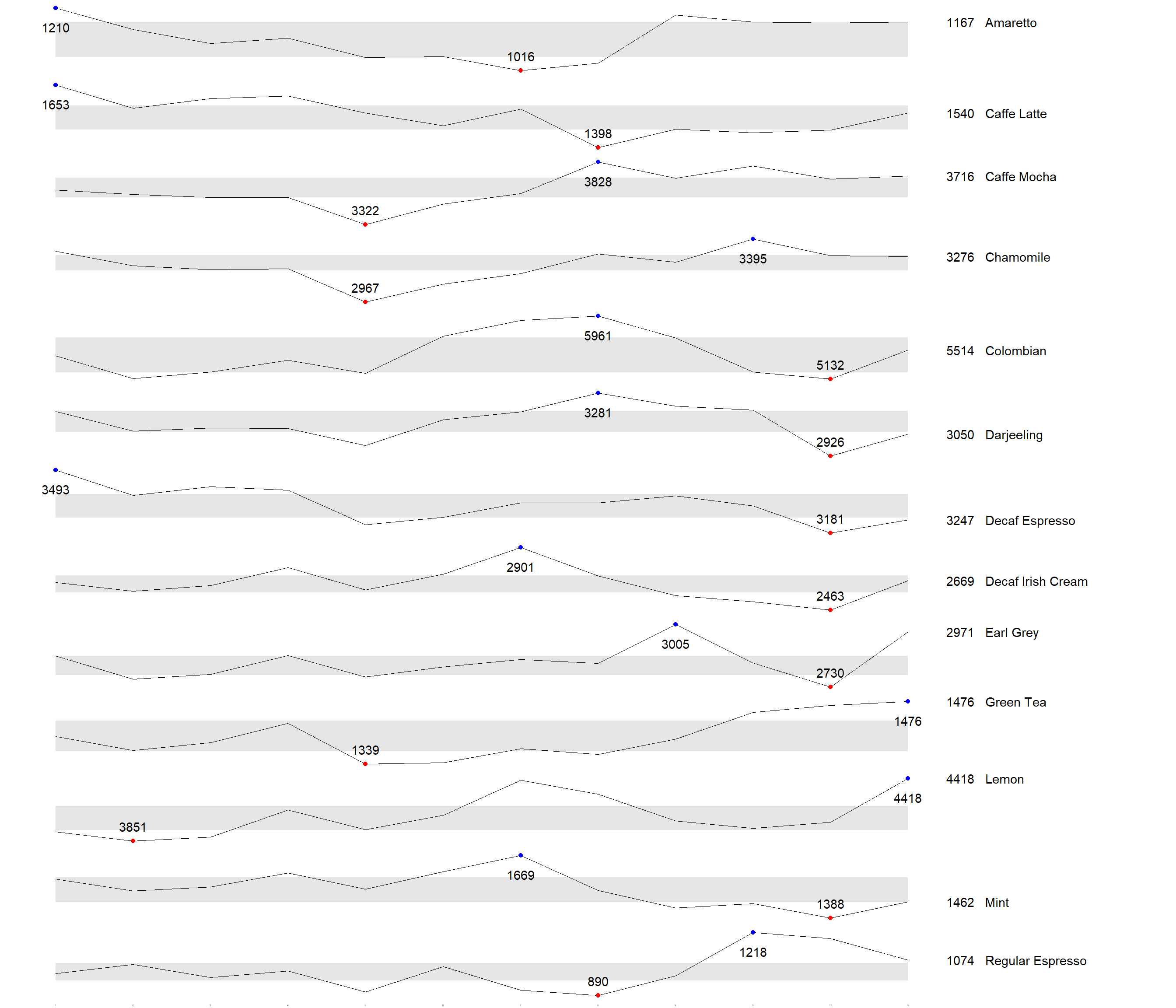
Static Information Dashboard Design: gt and gtExtras methods
In this section, you will learn how to create static information dashboard by using gt and gtExtras packages. Before getting started, it is highly recommended for you to visit the webpage of these two packages and review all the materials provided on the webpages at least once. You done not have to understand and remember everything provided but at least have an overview of the purposes and functions provided by them.
Plotting a simple bullet chart
In this section, you will learn how to prepare a bullet chart report by using functions of gt and gtExtras packages.
product %>%
  gt::gt() %>%
  gt_plt_bullet(column = current,
              target = target,
              width = 60,
              palette = c("lightblue",
                          "black")) %>%
gt_theme_538()| Product | current |
|---|---|
| Amaretto | |
| Caffe Latte | |
| Caffe Mocha | |
| Chamomile | |
| Colombian | |
| Darjeeling | |
| Decaf Espresso | |
| Decaf Irish Cream | |
| Earl Grey | |
| Green Tea | |
| Lemon | |
| Mint | |
| Regular Espresso |
sparklines: gtExtras method
Before we can prepare the sales report by product by using gtExtras functions, code chunk below will be used to prepare the data.
report <- coffeechain %>%
  mutate(Year = year(Date)) %>%
  filter(Year == "2013") %>%
  mutate (Month = month(Date,
                        label = TRUE,
                        abbr = TRUE)) %>%
  group_by(Product, Month) %>%
  summarise(Sales = sum(Sales)) %>%
  ungroup()
It is important to note that one of the requirement of gtExtras functions is that almost exclusively they require you to pass data.frame with list columns. In view of this, code chunk below will be used to convert the report data.frame into list columns.
report %>%
  group_by(Product) %>%
  summarize('Monthly Sales' = list(Sales),
            .groups = "drop")
# A tibble: 13 × 2
Product `Monthly Sales`
<chr> <list>
1 Amaretto <dbl [12]>
2 Caffe Latte <dbl [12]>
3 Caffe Mocha <dbl [12]>
4 Chamomile <dbl [12]>
5 Colombian <dbl [12]>
6 Darjeeling <dbl [12]>
7 Decaf Espresso <dbl [12]>
8 Decaf Irish Cream <dbl [12]>
9 Earl Grey <dbl [12]>
10 Green Tea <dbl [12]>
11 Lemon <dbl [12]>
12 Mint <dbl [12]>
13 Regular Espresso <dbl [12]> Plotting Coffechain Sales report
report %>%
  group_by(Product) %>%
  summarize('Monthly Sales' = list(Sales),
            .groups = "drop") %>%
   gt() %>%
   gt_plt_sparkline('Monthly Sales',
                    same_limit = FALSE)
Adding statistics
First, calculate summary statistics by using the code chunk below.
report %>%
  group_by(Product) %>%
  summarise("Min" = min(Sales, na.rm = T),
            "Max" = max(Sales, na.rm = T),
            "Average" = mean(Sales, na.rm = T)
            ) %>%
  gt() %>%
  fmt_number(columns = 4,
decimals = 2)| Product | Min | Max | Average |
|---|---|---|---|
| Amaretto | 1016 | 1210 | 1,119.00 |
| Caffe Latte | 1398 | 1653 | 1,528.33 |
| Caffe Mocha | 3322 | 3828 | 3,613.92 |
| Chamomile | 2967 | 3395 | 3,217.42 |
| Colombian | 5132 | 5961 | 5,457.25 |
| Darjeeling | 2926 | 3281 | 3,112.67 |
| Decaf Espresso | 3181 | 3493 | 3,326.83 |
| Decaf Irish Cream | 2463 | 2901 | 2,648.25 |
| Earl Grey | 2730 | 3005 | 2,841.83 |
| Green Tea | 1339 | 1476 | 1,398.75 |
| Lemon | 3851 | 4418 | 4,080.83 |
| Mint | 1388 | 1669 | 1,519.17 |
| Regular Espresso | 890 | 1218 | 1,023.42 |
Combining the data.frame
Next, use the code chunk below to add the statistics on the table.
spark <- report %>%
  group_by(Product) %>%
  summarize('Monthly Sales' = list(Sales),
            .groups = "drop")
sales <- report %>%
group_by(Product) %>%
summarise("Min" = min(Sales, na.rm = T),
"Max" = max(Sales, na.rm = T),
"Average" = mean(Sales, na.rm = T)
)sales_data = left_join(sales, spark)Plotting the updated data.table
sales_data %>%
  gt() %>%
  gt_plt_sparkline('Monthly Sales',
same_limit = FALSE)| Product | Min | Max | Average | Monthly Sales |
|---|---|---|---|---|
| Amaretto | 1016 | 1210 | 1119.000 | |
| Caffe Latte | 1398 | 1653 | 1528.333 | |
| Caffe Mocha | 3322 | 3828 | 3613.917 | |
| Chamomile | 2967 | 3395 | 3217.417 | |
| Colombian | 5132 | 5961 | 5457.250 | |
| Darjeeling | 2926 | 3281 | 3112.667 | |
| Decaf Espresso | 3181 | 3493 | 3326.833 | |
| Decaf Irish Cream | 2463 | 2901 | 2648.250 | |
| Earl Grey | 2730 | 3005 | 2841.833 | |
| Green Tea | 1339 | 1476 | 1398.750 | |
| Lemon | 3851 | 4418 | 4080.833 | |
| Mint | 1388 | 1669 | 1519.167 | |
| Regular Espresso | 890 | 1218 | 1023.417 |
Combining bullet chart and sparklines
Similarly, we can combining the bullet chart and sparklines using the steps below.
bullet <- coffeechain %>%
  filter(Date >= "2013-01-01") %>%
  group_by(`Product`) %>%
  summarise(`Target` = sum(`Budget Sales`),
            `Actual` = sum(`Sales`)) %>%
  ungroup()
sales_data = sales_data %>%
left_join(bullet)sales_data %>%
gt() %>%
gt_plt_sparkline('Monthly Sales') %>%
gt_plt_bullet(column = Actual,
target = Target,
width = 28,
palette = c("lightblue",
"black")) %>%
gt_theme_538()| Product | Min | Max | Average | Monthly Sales | Actual |
|---|---|---|---|---|---|
| Amaretto | 1016 | 1210 | 1119.000 | ||
| Caffe Latte | 1398 | 1653 | 1528.333 | ||
| Caffe Mocha | 3322 | 3828 | 3613.917 | ||
| Chamomile | 2967 | 3395 | 3217.417 | ||
| Colombian | 5132 | 5961 | 5457.250 | ||
| Darjeeling | 2926 | 3281 | 3112.667 | ||
| Decaf Espresso | 3181 | 3493 | 3326.833 | ||
| Decaf Irish Cream | 2463 | 2901 | 2648.250 | ||
| Earl Grey | 2730 | 3005 | 2841.833 | ||
| Green Tea | 1339 | 1476 | 1398.750 | ||
| Lemon | 3851 | 4418 | 4080.833 | ||
| Mint | 1388 | 1669 | 1519.167 | ||
| Regular Espresso | 890 | 1218 | 1023.417 |
Interactive Information Dashboard Design: reactable and reactablefmtr methods
In this section, you will learn how to create interactive information dashboard by using reactable and reactablefmtr packages. Before getting started, it is highly recommended for you to visit the webpage of these two packages and review all the materials provided on the webpages at least once. You done not have to understand and remember everything provided but at least have an overview of the purposes and functions provided by them.
In order to build an interactive sparklines, we need to install dataui R package by using the code chunk below.
remotes::install_github("timelyportfolio/dataui")Next, you all need to load the package onto R environment by using the code chunk below.
library(dataui)Plotting interactive sparklines
Similar to gtExtras, to plot an interactive sparklines by using reactablefmtr package we need to prepare the list field by using the code chunk below.
report <- report %>%
  group_by(Product) %>%
  summarize(`Monthly Sales` = list(Sales))
Next, react_sparkline will be to plot the sparklines as shown below.
reactable(
  report,
  columns = list(
    Product = colDef(maxWidth = 200),
    `Monthly Sales` = colDef(
      cell = react_sparkline(report)
    )
  )
)
Changing the pagesize
By default the pagesize is 10. In the code chunk below, arguments defaultPageSize is used to change the default setting.
reactable(
  report,
  defaultPageSize = 13,
  columns = list(
    Product = colDef(maxWidth = 200),
    `Monthly Sales` = colDef(
      cell = react_sparkline(report)
    )
  )
)
Adding points and labels
In the code chunk below highlight_points argument is used to show the minimum and maximum values points and label argument is used to label first and last values.
reactable(
  report,
  defaultPageSize = 13,
  columns = list(
    Product = colDef(maxWidth = 200),
    `Monthly Sales` = colDef(
      cell = react_sparkline(
        report,
        highlight_points = highlight_points(
          min = "red", max = "blue"),
        labels = c("first", "last")
        )
    )
  )
)
Adding reference line
In the code chunk below statline argument is used to show the mean line.
reactable(
  report,
  defaultPageSize = 13,
  columns = list(
    Product = colDef(maxWidth = 200),
    `Monthly Sales` = colDef(
      cell = react_sparkline(
        report,
        highlight_points = highlight_points(
          min = "red", max = "blue"),
        statline = "mean"
        )
    )
  )
)
Adding bandline
Instead adding reference line, bandline can be added by using the bandline argument.
reactable(
  report,
  defaultPageSize = 13,
  columns = list(
    Product = colDef(maxWidth = 200),
    `Monthly Sales` = colDef(
      cell = react_sparkline(
        report,
        highlight_points = highlight_points(
          min = "red", max = "blue"),
        line_width = 1,
        bandline = "innerquartiles",
        bandline_color = "green"
        )
    )
  )
)
Changing from sparkline to sparkbar
Instead of displaying the values as sparklines, we can display them as sparkbars as shiwn below.
reactable(
  report,
  defaultPageSize = 13,
  columns = list(
    Product = colDef(maxWidth = 200),
    `Monthly Sales` = colDef(
      cell = react_sparkbar(
        report,
        highlight_bars = highlight_bars(
          min = "red", max = "blue"),
        bandline = "innerquartiles",
        statline = "mean")
    )
  )
)