pacman::p_load(tidyverse, patchwork, readr, dplyr, plotly, ggridges, ggiraph, ggthemes)Take-home Exercise 3: Be Weatherwise or Otherwise
Overview
The primary objective of this project is to apply visual analytics techniques to validate climate change projections regarding daily mean temperature fluctuations. Specifically, we aim to explore the projected temperature increases, which range from 1.4 to 4.6 degrees Celsius, as indicated in an office report from National Climate Change Secretariat Singapore.

We seek to employ newly acquired methods of visual interactivity and uncertainty visualization to assess and validate the claims presented in the report.
Data Preparation
Importing packages
In this take home exercise we are going to utilise several package:
- tidyverse (to wrangle and plot our data)
- patchwork (to plot multiple plot in the same figure)
- readr (to read rectangular data from delimited files)
- dplyr (provides a set of functions for data manipulation tasks)
- plotly (to create interactive web-based visualizations)
- ggridges (for creating ridge plots in R using the ggplot2 plotting system)
- ggiraph (adding interactive features to ggplot2 plots)
- ggthemes (provides additional themes and color palettes for ggplot2 plots)
Importing dataset
The data we ware going to use is the historical daily temperature data from Meteorological Service Singapore website. We will be looking at the daily records of May (as May has the highest average monthly temperature based on Meteorological Service Singapore) in the years 1983, 1993, 2003, 2013, and 2023 at the Changi Weather Station.
Show the code
May_dataset<- c("data/DAILYDATA_S24_198305.csv", "data/DAILYDATA_S24_199305.csv",
                "data/DAILYDATA_S24_200305.csv", "data/DAILYDATA_S24_201305.csv",
                "data/DAILYDATA_S24_202305.csv")
Show the code
May_temp <- lapply(May_dataset, read_csv, col_names = FALSE,
                        col_select = c(1,2, 3, 4, 9, 10, 11),skip = 1) %>%
  bind_rows(.id = "file")

colnames(May_temp) <- c("ID", "Station", "Year", "Month", "Day"
                              , "Mean_Temperature",
                              "Maximum_Temperature", "Minimum_Temperature")

May_temp$Year <- as.factor(May_temp$Year)
Dataset Overview
We are going to use the datatable() function to inspect the combined data set.
DT::datatable(May_temp, class= "compact")Exploratory Data Analysis (EDA)
Ridgeline Plots of Temperature Variables
The geom_density_ridges() function in the ggridges package is used to create ridge plots, also known as density ridgeline plots. Ridge plots are a method of displaying the distribution of a numeric variable grouped by one or more categorical variables. These plots are particularly useful for visualizing the distribution of a variable across different groups and identifying patterns or differences in the distributions.
Show the code
colors_vector <- c("grey25", "grey40", "grey60", "grey70","grey80" )
opacities_vector <- c(0.5, 0.6, 0.7, 0.8,0.9 )

p1 <- ggplot(May_temp,
             aes(x = Mean_Temperature, y = factor(Year), fill = factor(Year), alpha = factor(Year))) +
  geom_density_ridges() +
  labs(title = "Distribution of Mean Temperature in May between 1983-2023",
       x = "Degrees Celsius",
       y = "Year") +
  scale_fill_manual(values = colors_vector) +
  scale_alpha_manual(values = opacities_vector) +
  theme_ridges() +
  theme(legend.position = "none")

p1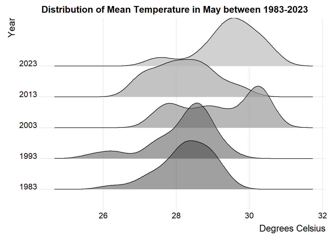
Show the code
colors_vector <- c("grey25", "grey40", "grey60", "grey70","grey80" )
opacities_vector <- c(0.5, 0.6, 0.7, 0.8,0.9 )

p2 <- ggplot(May_temp,
             aes(x = Maximum_Temperature, y = factor(Year), fill = factor(Year), alpha = factor(Year))) +
  geom_density_ridges() +
  labs(title = "Distribution of Maximum Temperature in May between 1983-2023",
       x = "Degrees Celsius",
       y = "Year") +
  scale_fill_manual(values = colors_vector) +
  scale_alpha_manual(values = opacities_vector) +
  theme_ridges() +
  theme(legend.position = "none")

p2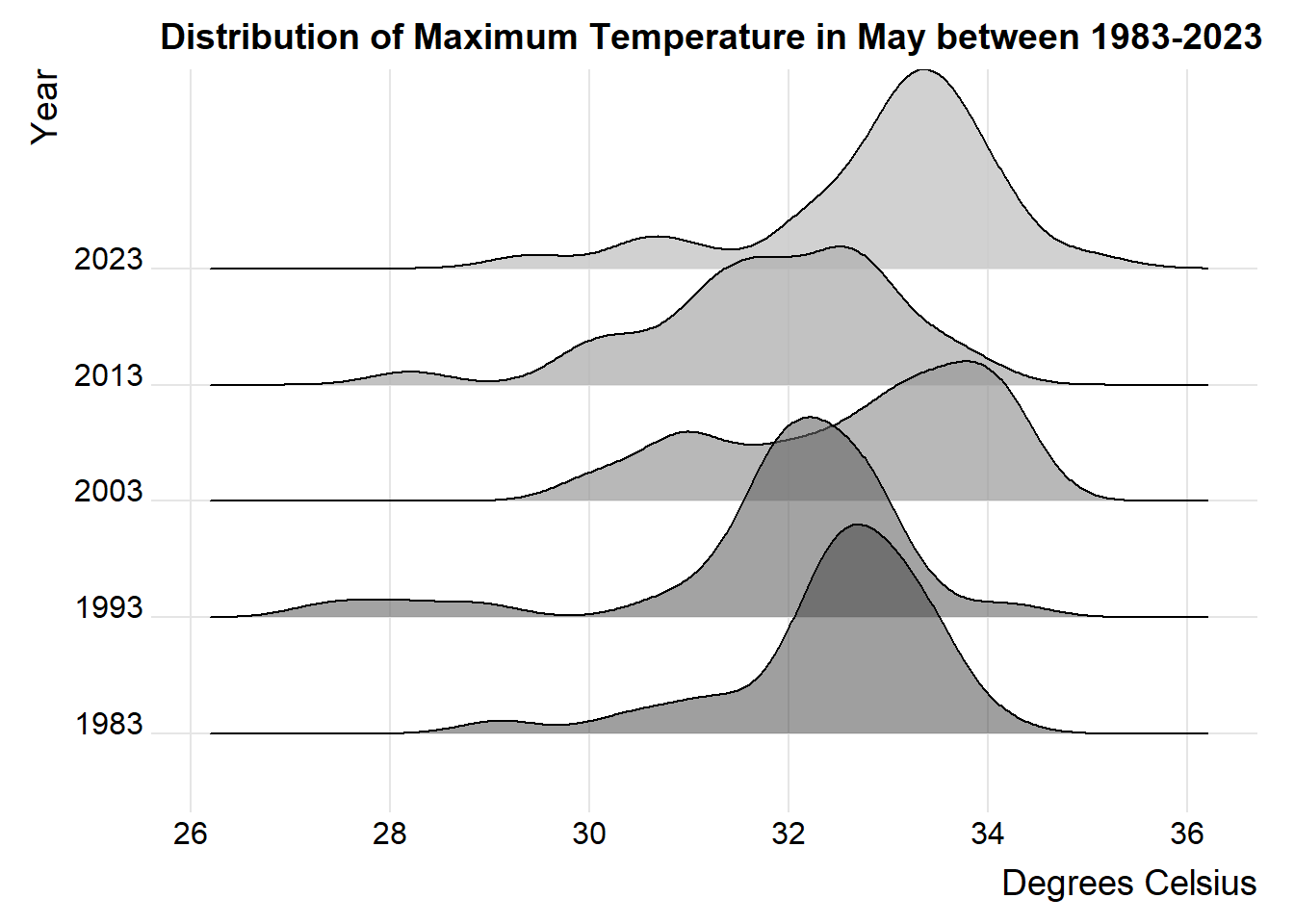
Show the code
colors_vector <- c("grey25", "grey40", "grey60", "grey70","grey80" )
opacities_vector <- c(0.5, 0.6, 0.7, 0.8,0.9 )
p3 <- ggplot(May_temp,
             aes(x = Minimum_Temperature, y = factor(Year), fill = factor(Year), alpha = factor(Year))) +
  geom_density_ridges() +
  labs(title = "Distribution of Minimum Temperature in May between 1983-2023",
       x = "Degrees Celsius",
       y = "Year") +
  scale_fill_manual(values = colors_vector) +
  scale_alpha_manual(values = opacities_vector) +
  theme_ridges() +
  theme(legend.position = "none")

p3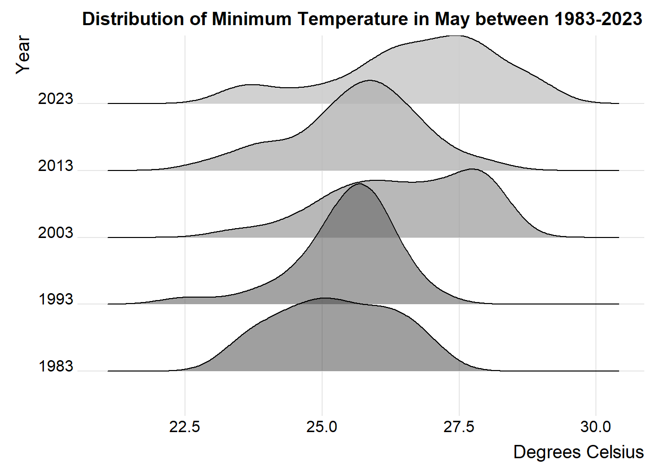
Observation
Mean Daily Temperature: From 1983 to 2023, there has been a consistent increase in the daily mean temperature. In the earlier years, such as 1983, the distribution of daily mean temperature values was more widely spread out compared to recent years, particularly noticeable in 2003 and 2013. Moreover, the majority of the distribution exhibits a left-skewed pattern, with the exception of 2013, which demonstrates a right-skewed distribution.
Maximum Daily Temperature: Over the period from 1983 to 2023, there has been a rise in the maximum daily temperature. The spread of maximum daily temperature values was broader in the earlier years, with 2023 showing the narrowest spread among the observed years. Furthermore, the distribution of maximum daily temperatures is consistently left-skewed across all years.
Minimum Daily Temperature: Between 1983 and 2023, observations indicate that during 1993 and 2013, the daily mean temperature values were narrower in comparison to 1983, 2003, and 2023, which displayed a more extensive spread. Additionally, most of the distribution demonstrates a left-skewed pattern, with 1983 being the exception, exhibiting a distribution that is more or less normal.
Line chart of Daily Mean Temperature
Show the code
point_desc <- c(paste0(
  "Day: ", May_temp$Day,
  "\nYear: ",May_temp$Year,
  "\nMean Temp: ", May_temp$Mean_Temperature, "°C"))

line <- ggplot(data = May_temp,
               aes(x = Day, y = Mean_Temperature,
                   group = Year,
                   color = Year,
                   data_id = Year)) +
  geom_line_interactive(size = 1.2) +
  geom_point_interactive(aes(tooltip = point_desc),
                         fill = "grey90",
                         size = 2,
                         stroke = 1,
                         shape = 21) +
  scale_color_manual(name = "Year",
                      values = c("1983" = "blue",
                                  "1993" = "red",
                                  "2003" = "purple",
                                  "2013" = "orange",
                                  "2023" = "black")) +
  labs(y = "Degrees Celsius",
       x = "Day of The Month",
       title = "Daily Mean Temperature for May 1986, 1993, 2003, 2013, 2023 ")

girafe(ggobj = line,
       width_svg = 10,
       height_svg = 5 ,
       options = list(
         opts_hover(css = "stroke-width: 1; opacity: 1;"),
         opts_hover_inv(css = "stroke-width: 1;opacity:0.1;")))
Show the code
a <- May_temp %>%
  filter(!(Year %in% c(1993, 2003, 2013, 2023))) %>%
  group_by(Day) %>%
  ggplot(., aes(Day, Mean_Temperature)) +
    geom_point() +
    geom_line() +
    geom_smooth(method = "loess") +
    theme(axis.title.x = element_blank(),
          legend.position = "none") +
    labs(title = "Mean Temperature Distribution for 1983", y = "Degrees Celsius") +
    NULL
ggplotly(a)
Show the code
b <- May_temp %>%
  filter(!(Year %in% c(1983, 2003, 2013, 2023))) %>%
  group_by(Day) %>%
  ggplot(., aes(Day, Mean_Temperature)) +
    geom_point() +
    geom_line() +
    geom_smooth(method = "loess") +
    theme(axis.title.x = element_blank(),
          legend.position = "none") +
    labs(title = "Mean Temperature Distribution for 1993", y = "Degrees Celsius") +
    NULL
ggplotly(b)
Show the code
c <- May_temp %>%
  filter(!(Year %in% c(1983, 1993, 2013, 2023))) %>%
  group_by(Day) %>%
  ggplot(., aes(Day, Mean_Temperature)) +
    geom_point() +
    geom_line() +
    geom_smooth(method = "loess") +
    theme(axis.title.x = element_blank(),
          legend.position = "none") +
    labs(title = "Mean Temperature Distribution for 2003", y = "Degrees Celsius") +
    NULL
ggplotly(c)
Show the code
d <- May_temp %>%
  filter(!(Year %in% c(1983, 1993, 2003, 2023))) %>%
  group_by(Day) %>%
  ggplot(., aes(Day, Mean_Temperature)) +
    geom_point() +
    geom_line() +
    geom_smooth(method = "loess") +
    theme(axis.title.x = element_blank(),
          legend.position = "none") +
    labs(title = "Mean Temperature Distribution for 2013", y = "Degrees Celsius") +
    NULL
ggplotly(d)
Show the code
e <- May_temp %>%
  filter(!(Year %in% c(1983, 1993, 2003, 2013))) %>%
  group_by(Day) %>%
  ggplot(., aes(Day, Mean_Temperature)) +
    geom_point() +
    geom_line() +
    geom_smooth(method = "loess") +
    theme(axis.title.x = element_blank(),
          legend.position = "none") +
    labs(title = "Mean Temperature Distribution for 2023", y = "Degrees Celsius") +
    NULL
ggplotly(e)
Observation
- All: The temperature has indeed risen over the last half-century, as illustrated in the line chart, with notable increases observed between 1993 to 2003 and from 2013 to 2023. The highest mean temperature was recorded on day 13 of 2023, reaching 30.7°C, while the lowest was documented on day 29 of 1993, at 25.7°C.
1983: In 1983, the maximum daily mean temperature for May occurred on day 31, reaching 29.4°C, while the lowest was recorded on day 9, measuring 26.2°C. Throughout the month, the trend line of the daily mean temperature appeared relatively stable, showing no notable increase or decrease.
1993: In 1993, the maximum daily mean temperature for May occurred on day 14, reaching 29.5°C, while the lowest was recorded on day 29, measuring 25.7°C. Throughout the month, the trend line of the daily mean temperature appeared relatively stable, showing no notable increase or decrease.
2003: In 2003, the maximum daily mean temperature for May occurred on day 24, reaching 30.6°C, while the lowest was recorded on day 10, measuring 27.4°C. Throughout the month, the trend line of the daily mean temperature appeared to be on the rise.
2013: In 2013, the maximum daily mean temperature for May occurred on day 13, reaching 29.9°C, while the lowest was recorded on day 30, measuring 26.9°C. Throughout the month, the trend line of the daily mean temperature appeared to be decreasing.
2023: In 2023, the maximum daily mean temperature for May occurred on day 13, reaching 30.7°C, while the lowest was recorded on day 21, measuring 27.4°C. Throughout the month, the trend line of the daily mean temperature appeared to be on the rise.
Boxplot of Daily Mean Temperature
Show the code
boxplot <- plot_ly(data = May_temp,
  type = "box",
  x = ~Year,
  y = ~Mean_Temperature,
  color = I("grey"),
  marker = list(size = 3),
  name = "Mean Temperature",
  jitter = 0.3) %>%
layout(xaxis = list(title = "Year"),
        yaxis = list(title = "Degrees Celsius"))

mean_trend <- aggregate(Mean_Temperature ~ Year, data = May_temp, FUN = mean)
boxplot <- add_trace(boxplot,
  data = mean_trend,
  type = "scatter",
  mode = "lines+markers",
  x = ~Year,
  y = ~Mean_Temperature,
  color = I("red"),
  line = list(color = "red", dash = 'dash'),name = "Mean Trend Line")

boxplot <- add_trace(boxplot,
  data = May_temp,
  type = "scatter",
  mode = "markers",
  x = ~Year,
  y = ~Mean_Temperature,
  name = "Daily Mean Temperature",
  color = I("blue"),
  marker = list(size = 3,color = "blue",
    symbol = "circle",line = list(width = 0.5)),
  desc = ~paste("Temperature: ", Mean_Temperature, "ºC"),
  hoverinfo = "desc")

boxplot
Observation
From the box plot, observing that the year 2003 has a longer box compared to the rest of the years suggests that the daily mean temperatures in 2003 had a wider range and were more variable compared to other years depicted in the plot. This variation might indicate increased volatility or fluctuations in temperatures throughout the year 2003.
From the trend line analysis, it’s evident that from 1983 to 1993, the daily mean temperature trend remained relatively stable, with no significant increase or decrease observed. However, between 1993 and 2003, there was a noticeable upward trend in the daily mean temperature. Subsequently, from 2003 to 2013, the trend line depicted a decrease in the daily mean temperature. However, from 2013 to 2023, there was a clear upward trend, culminating in the highest mean temperature observed among the past years.
The positioning of the box plot for 2023 at the highest level, along with 10 days of daily mean temperature exceeding the highest recorded daily mean temperature in 1983, and with the monthly mean temperature ranging from 28.3 °C in 1983 to 29.5 °C in 2023, strongly indicates a significant increase in temperature during 2023 compared to 1983.
Conclusion
The presented visualization suggests a distinct upward trajectory in temperature in the Singapore Changi region from 1983 to 2023. When comparing 2023 to four decades ago, there is a noteworthy increase of 0.9°C (lower than the projected temperature increases, which range from 1.4°C to 4.6°C).
In May 2023, temperatures on most days have risen compared to the corresponding days in 1983, and there is a considerable rise in the number of hot days in 2023 compared to 1983. This disparity holds significance in terms of both human perception and its environmental impact.