pacman::p_load(ggHoriPlot, ggthemes, tidyverse)In-class Exercise 6: Horizon Plot
Overview
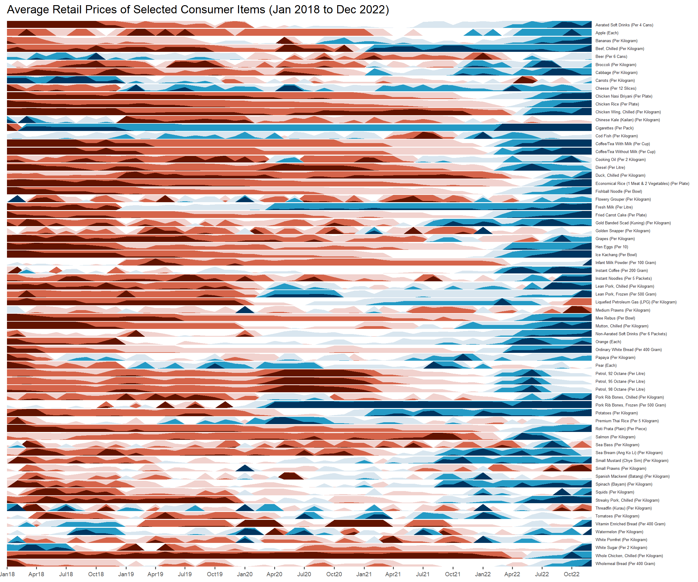
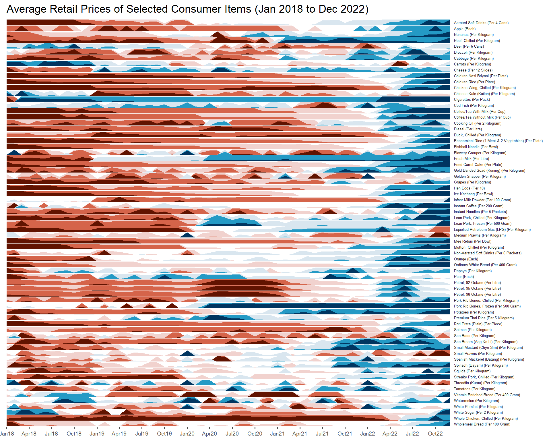
A horizon graph is an analytical graphical method specially designed for visualising large numbers of time-series. It aims to overcome the issue of visualising highly overlapping time-series.
A horizon graph essentially an area chart that has been split into slices and the slices then layered on top of one another with the areas representing the highest (absolute) values on top. Each slice has a greater intensity of colour based on the absolute value it represents.
In this section, you will learn how to plot a horizon graph by using ggHoriPlot package.
Tip
Before getting started, please visit Getting Started to learn more about the functions of ggHoriPlot package. Next, read geom_horizon() to learn more about the usage of its arguments.
Getting Started
Before getting start, make sure that ggHoriPlot has been included in the pacman::p_load(...) statement above.
For the purpose of this hands-on exercise, Average Retail Prices Of Selected Consumer Items will be used.
Use the code chunk below to import the AVERP.csv file into R environment.
averp <- read_csv("data/AVERP.csv") %>%
  mutate(`Date` = dmy(`Date`))
By default, read_csv will import data in Date field as Character data type. dmy() of lubridate package to palse the Date field into appropriate Date data type in R.
Plotting the horizon graph
Next, the code chunk below will be used to plot the horizon graph.
averp %>%
  filter(Date >= "2018-01-01") %>%
  ggplot() +
  geom_horizon(aes(x = Date, y=Values),
               origin = "midpoint",
               horizonscale = 6)+
  facet_grid(`Consumer Items`~.) +
    theme_few() +
  scale_fill_hcl(palette = 'RdBu') +
  theme(panel.spacing.y=unit(0, "lines"), strip.text.y = element_text(
    size = 5, angle = 0, hjust = 0),
    legend.position = 'none',
    axis.text.y = element_blank(),
    axis.text.x = element_text(size=7),
    axis.title.y = element_blank(),
    axis.title.x = element_blank(),
    axis.ticks.y = element_blank(),
    panel.border = element_blank()
    ) +
    scale_x_date(expand=c(0,0), date_breaks = "3 month", date_labels = "%b%y") +
  ggtitle('Average Retail Prices of Selected Consumer Items (Jan 2018 to Dec 2022)')